Free printable worksheet · History
Free violent crime chart worksheet with answer key
Is violent crime in the U.S. going up or down? A one-page worksheet on a chart of trustworthy public data, with three questions and lines to write on, plus an answer key for you. Free, no account needed, and the numbers are the newest the source has published.
The chart on the worksheet
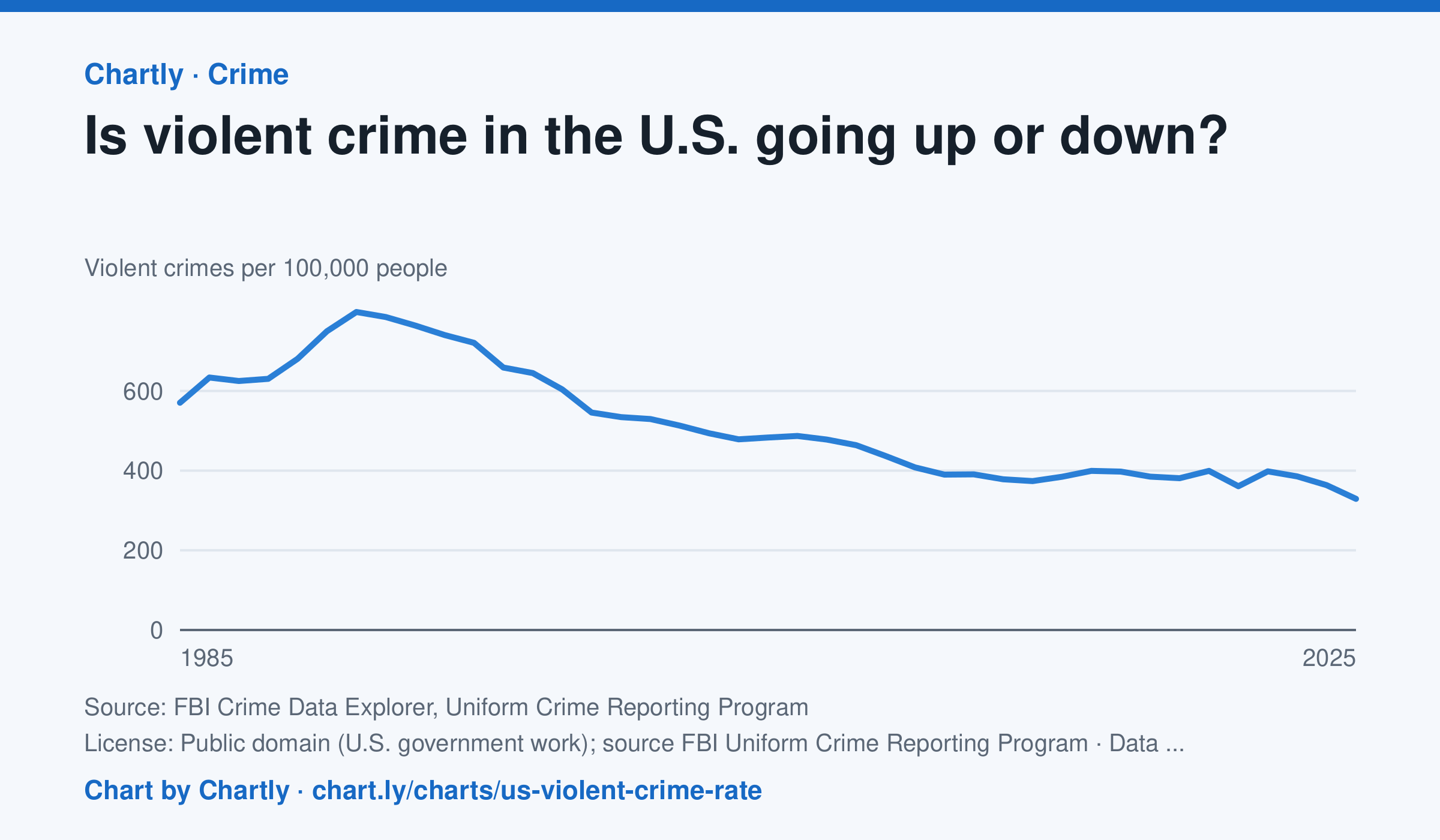
Down, over the long run. Police reported about 329 violent crimes per 100,000 people in 2025, about 59% below the 1991 peak of about 798, and the lowest since at least 1985. The rate rose in 2020 and 2022, then fell in 2023, 2024 and 2025. In 2021 the FBI stopped taking its old summary reports and accepted only its newer, more detailed system (NIBRS); many police departments hadn't switched yet, so agencies covering only about 77% of Americans reported, against 88 to 98% in other years, and 2021's number is less certain. Rates count only the agencies that reported, so they differ a little from the FBI's national estimates, and the FBI widened its definition of rape in 2013.
Source: FBI Crime Data Explorer, Uniform Crime Reporting Program (Public domain (U.S. government work); source FBI Uniform Crime Reporting Program) · Data as of Dec 31, 2025 · Open the interactive chart and its numbers
What students answer
How to read this chart
Each point is the number of violent crimes police reported for every 100,000 Americans that year. The line starts at zero, so its height shows the true size. In 2021 the FBI changed how it collects reports and fewer police departments sent numbers, so that year is less certain than the others.
Questions to discuss
- Find the year with the highest rate. About how much lower is the rate in the latest year?
- Many people say they think crime is rising. How could that belief and this chart both seem true to different people?
- Why might a change in how crimes are counted, like the one in 2021, make one year hard to compare with the rest?
The answer key gives the chart's key numbers (newest, highest, lowest, biggest change) and, for each question, the figures it asks about, written from the same data students see.
Or assign it online
Post this link in Google Classroom, Canvas or Moodle. Students see the interactive chart and the questions; they don't need an account.
A chart for class, every Monday
One fresh chart of public data, three questions to discuss and a link that opens it as a class assignment, in your inbox each Monday. Free, no account. See this week's.