Free printable worksheet · Economics
Free jobs report chart worksheet with answer key
How many jobs did the US add each month? A one-page worksheet on a chart of trustworthy public data, with three questions and lines to write on, plus an answer key for you. Free, no account needed, and the numbers are the newest the source has published.
The chart on the worksheet
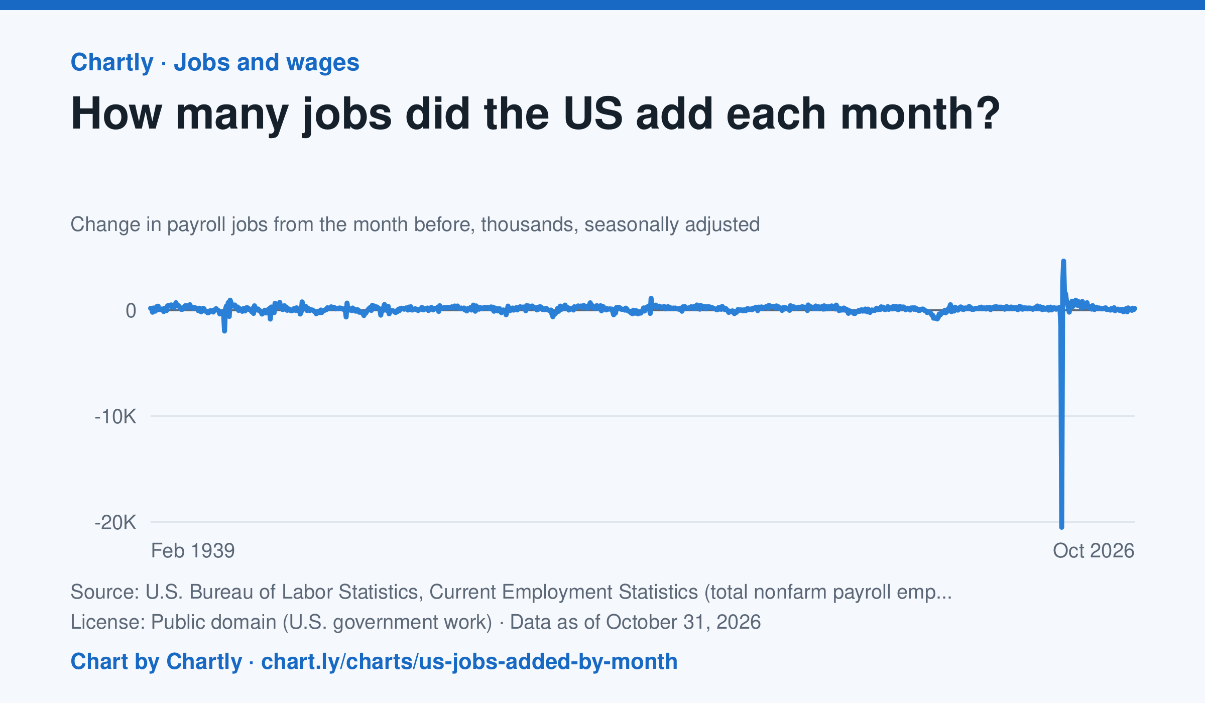
U.S. employers added 165 thousand jobs in October 2026, by the latest estimate, after adding 60 thousand in September 2026. Each point is the change in the number of jobs on payrolls from the month before, the headline figure of the monthly jobs report. Since 1939 the biggest loss was 20,469 thousand jobs in April 2020, when the pandemic closed businesses, and the biggest gain was 4,631 thousand in June 2020, as they reopened. BLS revises each month's figure in each of the next two reports as more employers answer, and once a year against unemployment insurance tax records.
Source: U.S. Bureau of Labor Statistics, Current Employment Statistics (total nonfarm payroll employment) (Public domain (U.S. government work)) · Data as of Oct 31, 2026 · Open the interactive chart and its numbers
What students answer
How to read this chart
Each point is how many jobs U.S. employers added or cut in one month, in thousands, compared with the month before. Points above zero mean more jobs; points below zero mean jobs were lost. This is the headline number of the monthly jobs report, and the newest months are estimates that get revised as more surveys come in.
Questions to discuss
- Find the lowest point on the chart. What happened that month, and how quickly did jobs come back?
- Count how many of the last 12 months were above zero. What does that tell you about the economy right now?
- Why do you think the government revises the newest months later, and why does it publish an estimate first anyway?
The answer key gives the chart's key numbers (newest, highest, lowest, biggest change) and, for each question, the figures it asks about, written from the same data students see.
Or assign it online
Post this link in Google Classroom, Canvas or Moodle. Students see the interactive chart and the questions; they don't need an account.
A chart for class, every Monday
One fresh chart of public data, three questions to discuss and a link that opens it as a class assignment, in your inbox each Monday. Free, no account. See this week's.