Free printable worksheet · Economics
Free net worth by age chart worksheet with answer key
What is the median household net worth by age? A one-page worksheet on a chart of trustworthy public data, with three questions and lines to write on, plus an answer key for you. Free, no account needed, and the numbers are the newest the source has published.
The chart on the worksheet
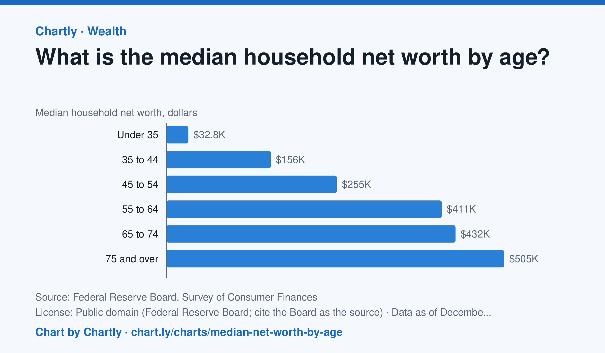
In the Federal Reserve's 2025 survey, the typical (median) household headed by someone under 35 had a net worth of $32,820, and one headed by someone 35 to 44 had $156,000. The median was $254,670 for ages 45 to 54, $411,340 for 55 to 64, $431,900 for 65 to 74 and $504,600 for 75 and over, about 15 times the under-35s'. The median is the household in the middle: half have more and half less. Averages are much higher, because a few households are very rich. Net worth is what a household owns (homes, retirement accounts, stocks, businesses, cars, bank accounts) minus what it owes (mortgages, student and car loans, credit cards). The survey is taken every three years, and figures are in dollars of the survey year. People of different ages also lived through different times, so this compares age groups, not one household's path through life.
Source: Federal Reserve Board, Survey of Consumer Finances (Public domain (Federal Reserve Board; cite the Board as the source)) · Data as of Dec 31, 2025 · Open the interactive chart and its numbers
What students answer
How to read this chart
Each bar is the median net worth of households, grouped by the age of the person who heads them. Net worth is what a household owns, such as a home, savings and retirement accounts, minus what it owes, such as a mortgage or student loans. The median is the household in the middle: half have more and half have less.
Questions to discuss
- Which age group has the highest median net worth, and about how many times the under-35 group's is it?
- Why might net worth keep rising through most of a working life, and why might it fall for the oldest group?
- A few very rich households pull the average far above the median. Why is the median a better picture of a typical household?
The answer key gives the chart's key numbers (newest, highest, lowest, biggest change) and, for each question, the figures it asks about, written from the same data students see.
Or assign it online
Post this link in Google Classroom, Canvas or Moodle. Students see the interactive chart and the questions; they don't need an account.
A chart for class, every Monday
One fresh chart of public data, three questions to discuss and a link that opens it as a class assignment, in your inbox each Monday. Free, no account. See this week's.