Free printable worksheet · Economics
Free health spending by country chart worksheet with answer key
How much does each country spend on health care per person? A one-page worksheet on a chart of trustworthy public data, with three questions and lines to write on, plus an answer key for you. Free, no account needed, and the numbers are the newest the source has published.
The chart on the worksheet
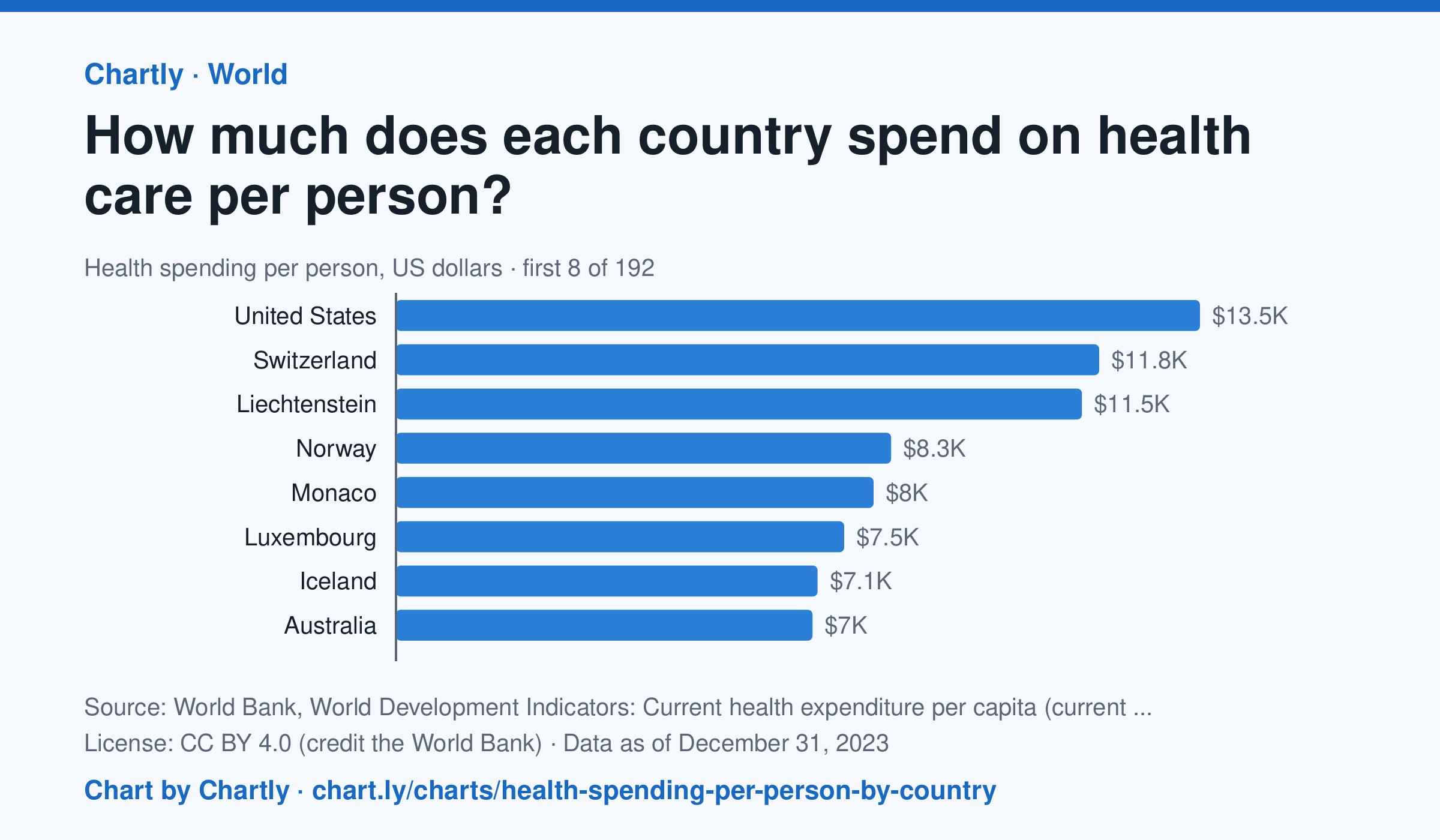
In 2023, the United States spent $13,473 per person on health care, about 10 times the world figure of $1,317. Germany spent $6,395, Japan $3,638, China $763 and India $85; Madagascar spent the least, $17. Search 191 countries and territories. Spending counts what governments, insurers and households paid for health care, but not new hospitals or equipment, in US dollars at each year's exchange rates, not adjusted for differences in prices.
Source: World Bank, World Development Indicators: Current health expenditure per capita (current US$) (CC BY 4.0 (credit the World Bank)) · Data as of Dec 31, 2023 · Open the interactive chart and its numbers
What students answer
How to read this chart
Each bar is what a country spent on health care in a year, by governments, insurers and households together, divided by its population and turned into U.S. dollars. The dashed line is the world. The figures aren't adjusted for prices, so a dollar buys more care in some countries than others.
Questions to discuss
- About how many times the world figure does the United States spend per person?
- Does spending more on health care per person always mean people live longer? What other chart on Chartly could help you check?
- Doctors and nurses are paid less in some countries. How would that change what these dollar figures can tell you?
The answer key gives the chart's key numbers (newest, highest, lowest, biggest change) and, for each question, the figures it asks about, written from the same data students see.
Or assign it online
Post this link in Google Classroom, Canvas or Moodle. Students see the interactive chart and the questions; they don't need an account.
A chart for class, every Monday
One fresh chart of public data, three questions to discuss and a link that opens it as a class assignment, in your inbox each Monday. Free, no account. See this week's.