Print this worksheet, or choose "Save as PDF" in the print window to share a file.
Chart worksheet
Charts to read and discuss
Name:
Class:
Date:
Chart 1 of 3 · World
How has the world's population grown since 1960?
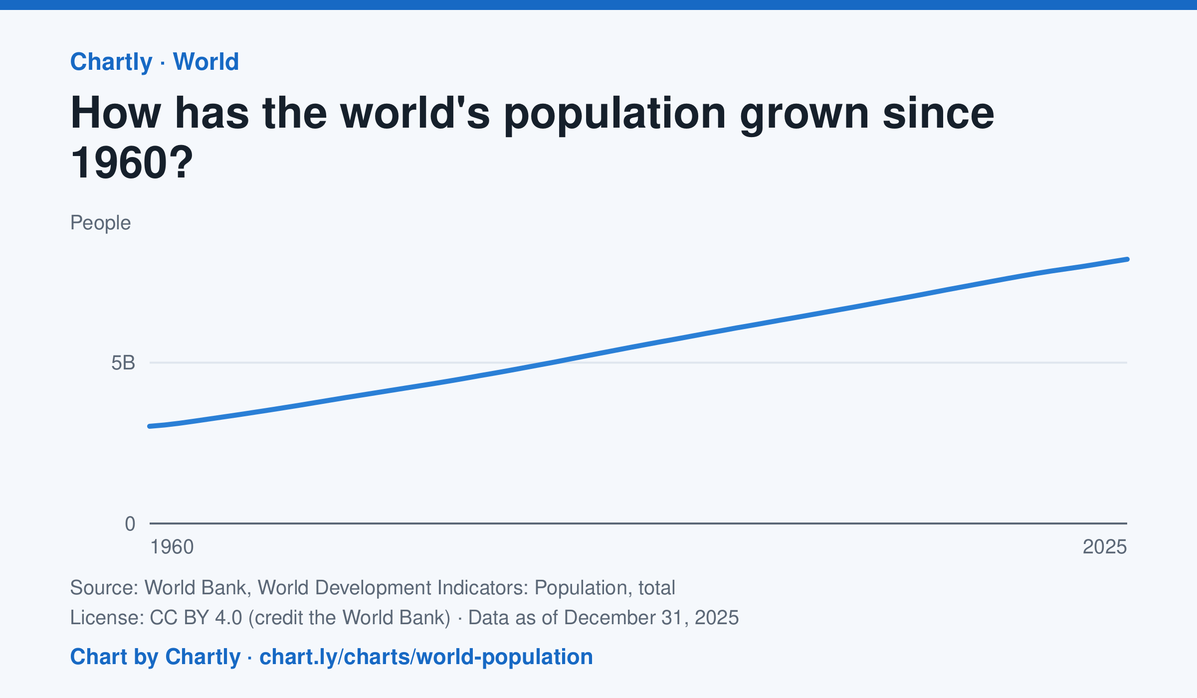
The world had 8.22 billion people in 2025, about 2.7 times the 3.02 billion of 1960. It passed 8 billion in 2023. Figures are mid-year estimates from the United Nations, which revises them as new censuses come in.
Source: World Bank, World Development Indicators: Population, total (CC BY 4.0 (credit the World Bank)) · Data as of Dec 31, 2025
How to read this chart
Each point is the number of people alive in the world in the middle of that year, estimated by the United Nations. The axis starts at zero, so the height of the line shows the true size. Look at how steep the line is to see how fast the population grew.
Questions
- Judging from the chart, about how many years did it take the world to add its most recent billion people?
- Is the line getting steeper or flatter in recent years? What does that tell you about the growth rate?
- These numbers are estimates that the UN revises. Why is it hard to count every person on Earth?
Chart and numbers: chart.ly/charts/world-population · More free charts at chart.ly
Chart 2 of 3 · Energy
How much has a gallon of gas cost in the US since 1990?
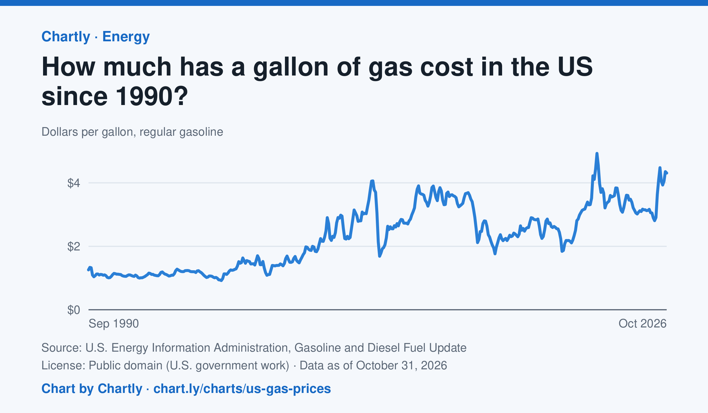
Regular gas averaged $4.31 a gallon in October 2026. The monthly average peaked at $4.93 in June 2022 and was lowest at $0.92 in February 1999. Each point averages EIA's weekly survey of gas stations nationwide, taxes included, in dollars of the day, not adjusted for inflation.
Source: U.S. Energy Information Administration, Gasoline and Diesel Fuel Update (Public domain (U.S. government work)) · Data as of Oct 31, 2026
How to read this chart
Each point is the average price of a gallon of regular gasoline in one month, in dollars, including taxes. The prices are not adjusted for inflation, so a dollar in 1990 bought more than a dollar does now. Gas prices follow the price of crude oil, so world events can move them quickly.
Questions
- Find the highest and lowest months on the chart. How many dollars apart are they?
- Pick a sharp drop on the chart. What world event could have made people use less gas or oil cost less?
- The chart isn't adjusted for inflation. How would that change the way the 1990s prices compare with today's?
Chart and numbers: chart.ly/charts/us-gas-prices · More free charts at chart.ly
Chart 3 of 3 · World
What share of people use the internet in each country?
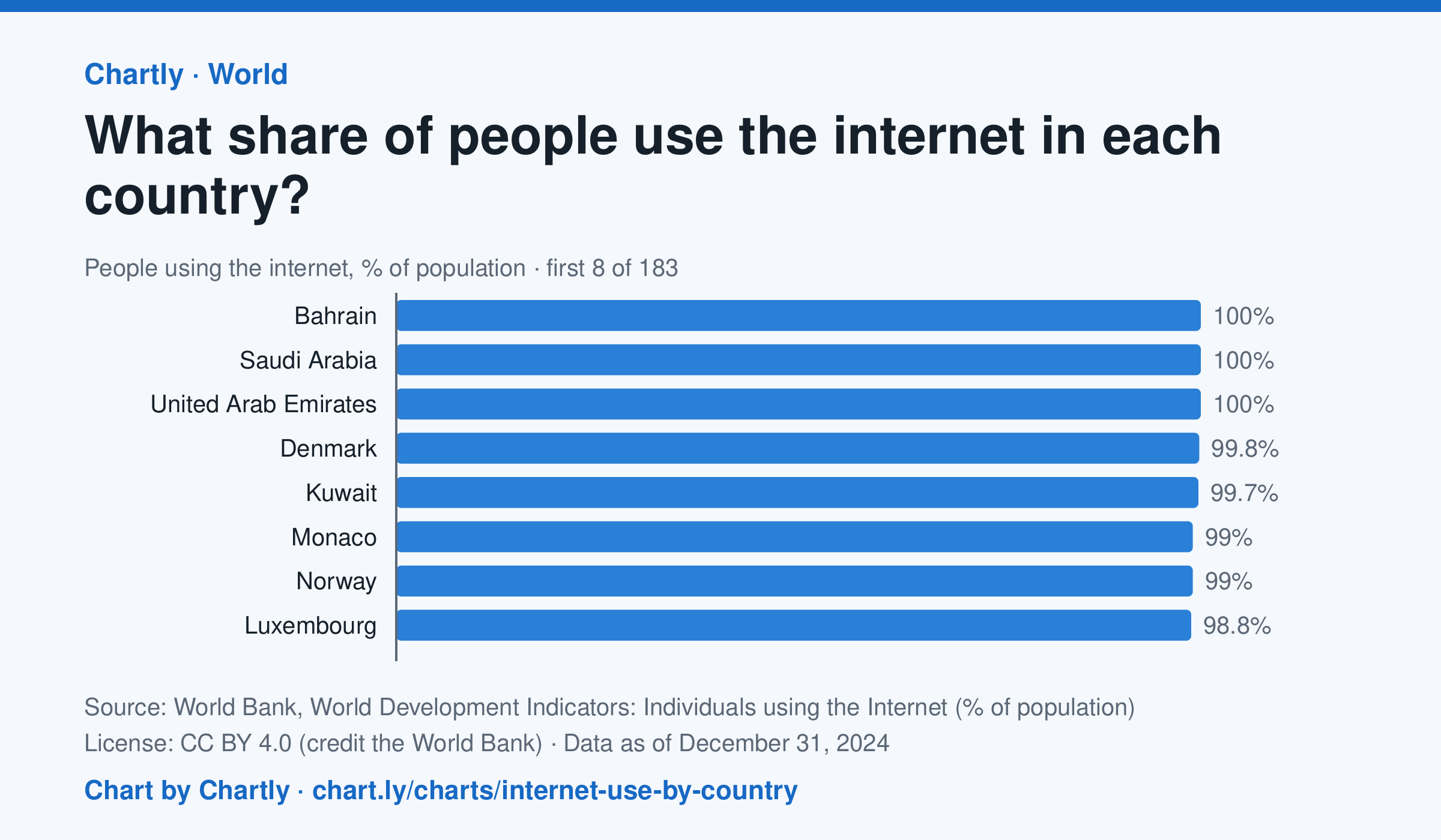
In 2024, 94.7% of people in the United States used the internet and 64.9% in India. The highest share was 100%, and the lowest 8.6%, in Burundi. 182 countries and territories had a 2024 figure. It counts people who used the internet at least once in the previous three months; places without a 2024 figure are left out.
Source: World Bank, World Development Indicators: Individuals using the Internet (% of population) (CC BY 4.0 (credit the World Bank)) · Data as of Dec 31, 2024
How to read this chart
Each bar is the share of a country's people who used the internet in the previous three months. The dashed line is the whole world. The chart opens on the top and bottom of the ranking; search for a country to find its bar among the rest.
Questions
- Find the United States and one country on another continent. How far apart are their shares?
- What do the countries at the bottom of the ranking have in common? What might keep people there offline?
- The world figure is closer to the bottom than many rich countries are to the top. Why might that be?
Chart and numbers: chart.ly/charts/internet-use-by-country · More free charts at chart.ly