Print this worksheet, or choose "Save as PDF" in the print window to share a file.
Chart worksheet
Charts to read and discuss
Name:
Class:
Date:
Chart 1 of 2 · Energy
Where does US electricity come from?
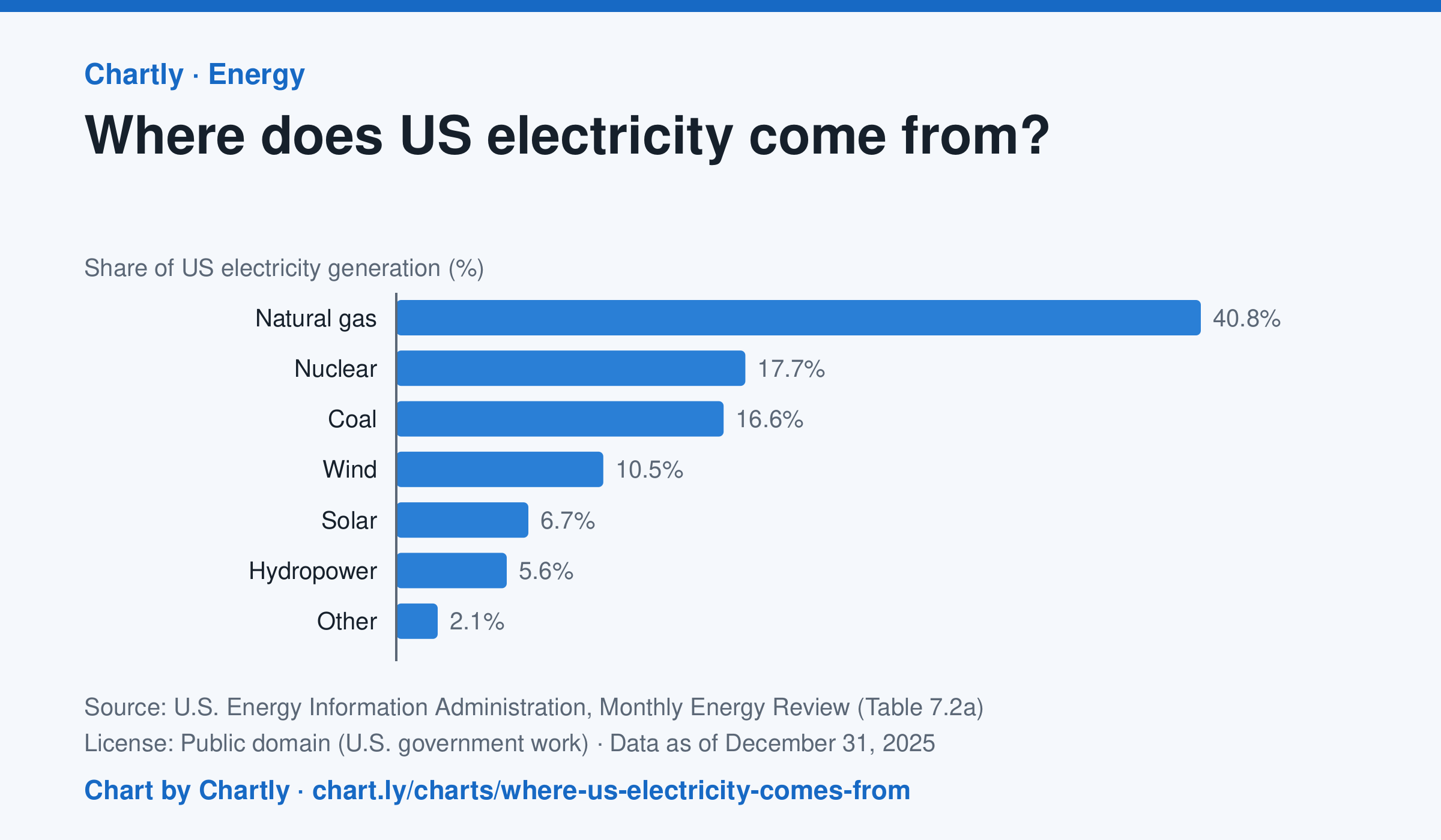
In 2025 natural gas made 40.8% of US electricity, followed by nuclear (17.7%) and coal (16.6%). Wind made 10.5% and solar 6.7%. Solar counts only utility-scale plants, not rooftop panels, and the 2025 figures are preliminary.
Source: U.S. Energy Information Administration, Monthly Energy Review (Table 7.2a) (Public domain (U.S. government work)) · Data as of Dec 31, 2025
How to read this chart
Each bar is one energy source's share of all the electricity made in the U.S. in a year, so the bars add up to about 100%. The bars start at zero, so a bar twice as long means twice the share. Solar counts only large power plants, not panels on rooftops.
Questions
- Which source makes the most electricity? About how many times more than the smallest bar?
- Which of these sources burn fuel and which don't? What share of electricity comes from each group?
- Why might a chart of this kind look different in your state than for the whole country?
Chart and numbers: chart.ly/charts/where-us-electricity-comes-from · More free charts at chart.ly
Chart 2 of 2 · Space
How many planets outside our solar system are discovered each year?
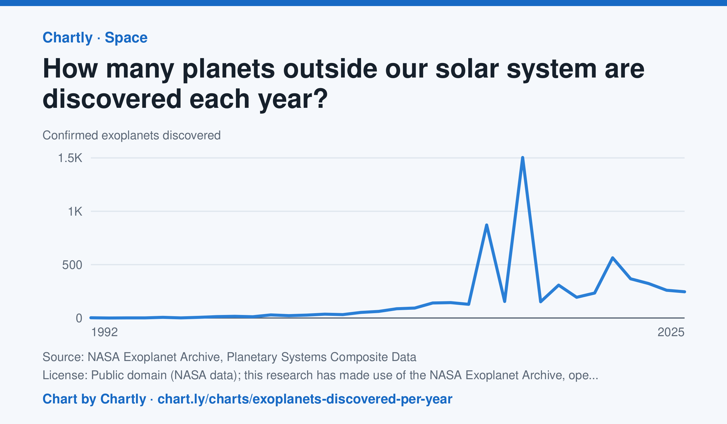
Astronomers confirmed 245 new planets around other stars in 2025. The first were found in 1992, and the count leaped in 2014 and 2016 (872 and 1,504), when NASA's Kepler team confirmed hundreds of its candidates at once. The archive counts a planet in the year its discovery was published and keeps adding late confirmations, so recent years can still rise.
Source: NASA Exoplanet Archive, Planetary Systems Composite Data (Public domain (NASA data); this research has made use of the NASA Exoplanet Archive, operated by Caltech under contract with NASA) · Data as of Dec 31, 2025
How to read this chart
Each point is how many planets around other stars, called exoplanets, astronomers confirmed in a year. The count depends on telescopes as much as on the sky: a new space telescope can confirm hundreds at once. The numbers come from NASA's Exoplanet Archive.
Questions
- Find the two biggest jumps on the chart. What could cause so many planets to be confirmed in one year?
- How many planets were confirmed in the first year on the chart, and how many in the newest year?
- Does a big year on this chart mean there were more planets in space that year? What does it really measure?
Chart and numbers: chart.ly/charts/exoplanets-discovered-per-year · More free charts at chart.ly