Print this worksheet, or choose "Save as PDF" in the print window to share a file.
Chart worksheet
Charts to read and discuss
Name:
Class:
Date:
Chart 1 of 3 · Climate
Which US states have warmed the most?
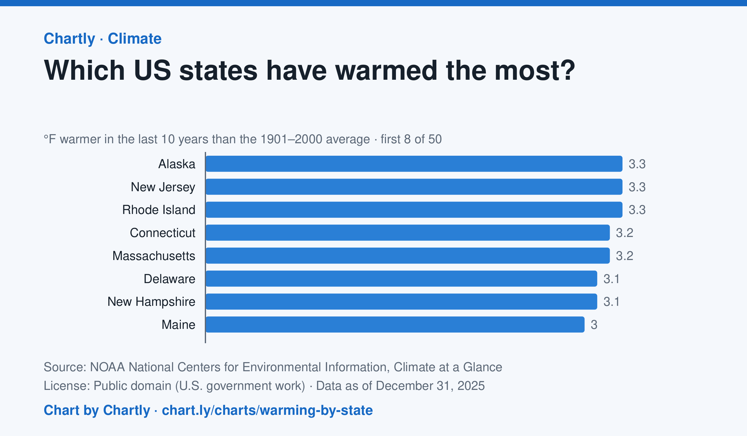
In the 10 years through 2025, Alaska was among the states that warmed most, averaging 3.3°F warmer than in 1901–2000, while Oklahoma was among those that warmed least, 1.6°F; the contiguous US warmed 2.2°F. Alaska's records start in 1925, so its baseline is 1925–2000. Hawaii's start in 1991, so it isn't included.
Source: NOAA National Centers for Environmental Information, Climate at a Glance (Public domain (U.S. government work)) · Data as of Dec 31, 2025
How to read this chart
Each bar shows how much warmer a state's last 10 years were than its average for 1901 to 2000, in degrees Fahrenheit. Ten years are averaged so one hot or cold year doesn't decide a state's place. The dashed line is the whole lower 48 states.
Questions
- Which states warmed the most and the least? How many degrees apart are they?
- Do the states that warmed most sit together in one part of the country, or are they spread out?
- Why do scientists compare with a long average like 1901 to 2000 instead of with just last year?
Chart and numbers: chart.ly/charts/warming-by-state · More free charts at chart.ly
Chart 2 of 3 · Federal budget
Where does federal spending go?
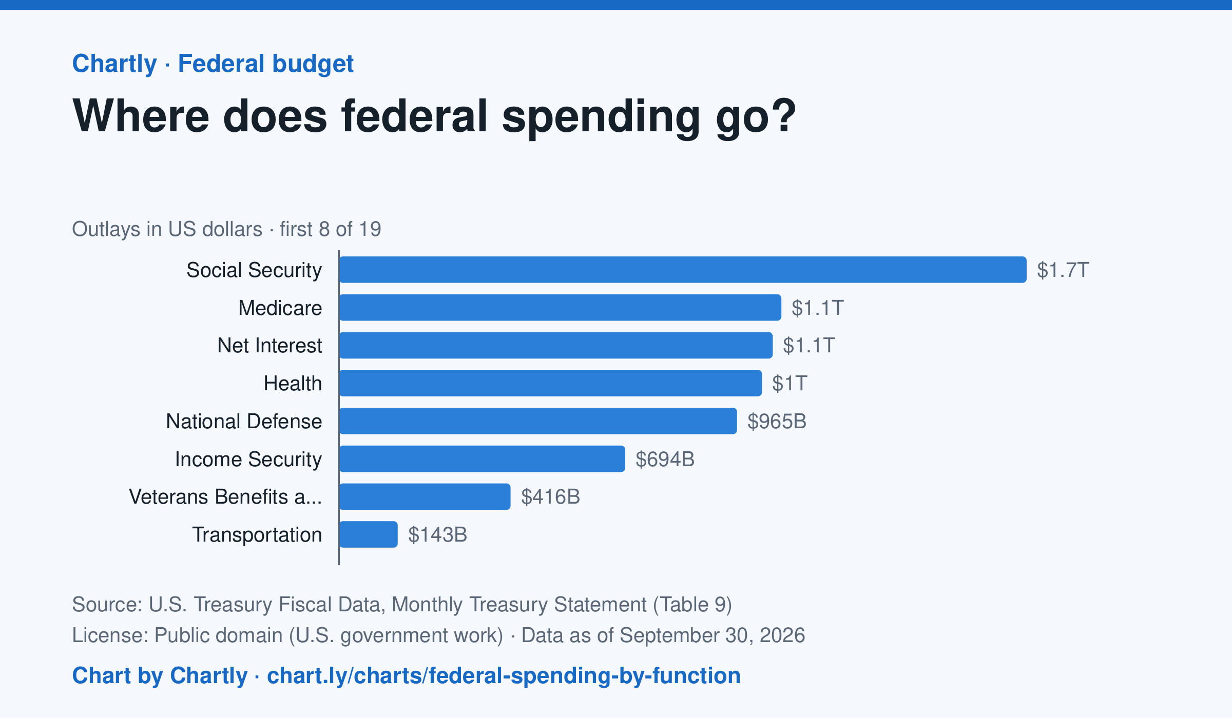
Social Security was the biggest item in fiscal 2026 at $1.67 trillion, out of $7.4 trillion in total. Next came Medicare ($1.07 trillion), Net Interest ($1.05 trillion), Health ($1.03 trillion) and National Defense ($965 billion). Two accounting lines are below zero, so the bars add up to the total.
Source: U.S. Treasury Fiscal Data, Monthly Treasury Statement (Table 9) (Public domain (U.S. government work)) · Data as of Sep 30, 2026
How to read this chart
Each bar is how much the federal government spent on one area in a fiscal year, which runs from October to September. The axis shows dollars: 1T is a trillion dollars, a thousand billion. One bar is below zero because it counts money the government takes back in, such as payments agencies make to each other, which lowers the total.
Questions
- Which area gets the most money? About how many times more than the smallest positive bar?
- Which of the biggest areas are paid to people directly, like retirees and patients, and which pay for services?
- If Congress wanted to cut spending by a lot, which bars would it have to change, and why is that hard?
Chart and numbers: chart.ly/charts/federal-spending-by-function · More free charts at chart.ly
Chart 3 of 3 · Earthquakes
How much rarer is each step up in earthquake magnitude?
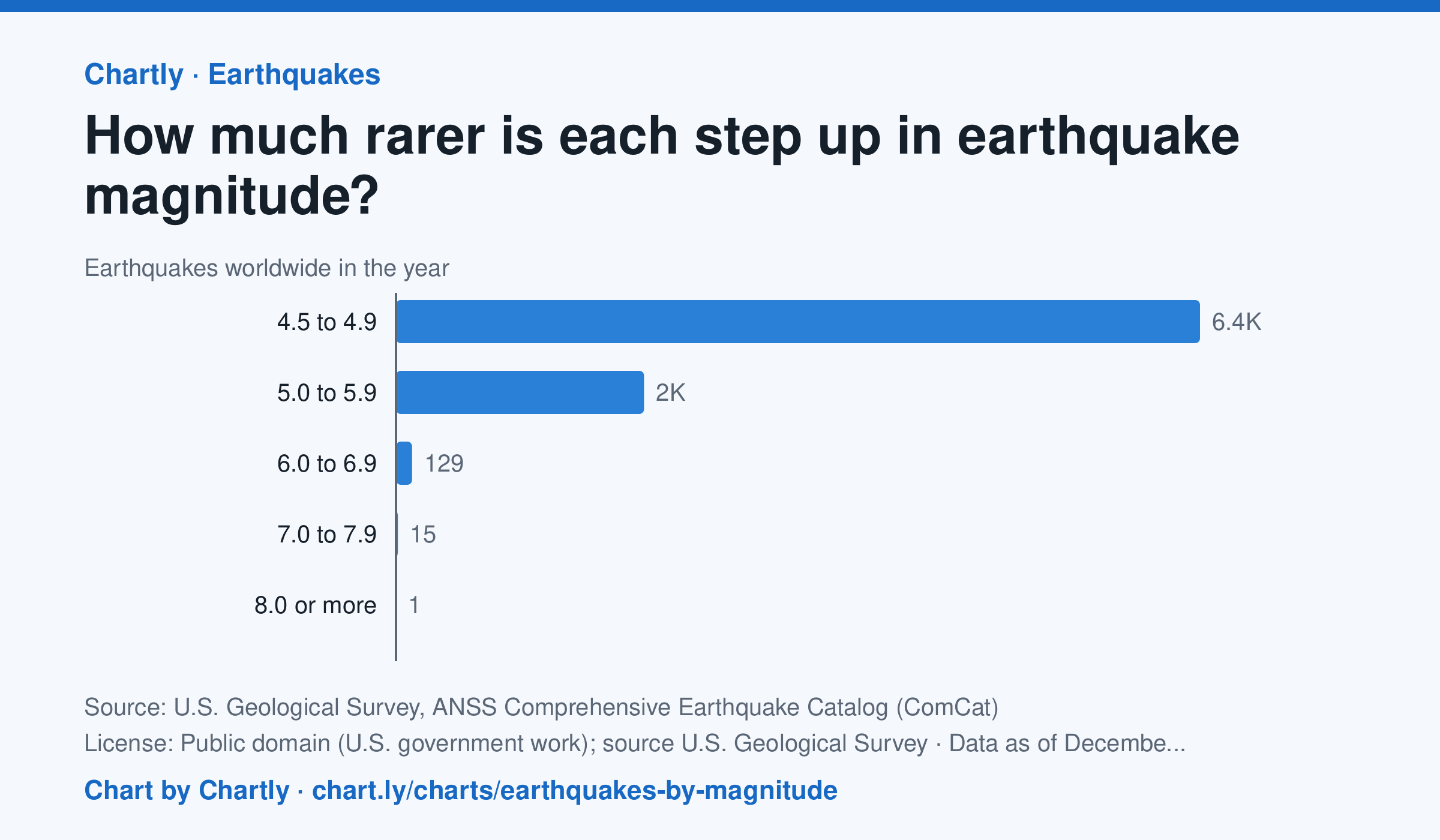
In 2025 the world recorded 6,428 earthquakes of magnitude 4.5 to 4.9, 1,983 of magnitude 5, 129 of magnitude 6, 15 of magnitude 7 and 1 of magnitude 8 or more. Each step up in magnitude is roughly ten times rarer, and releases about 32 times more energy. Countless smaller quakes go unrecorded worldwide, so the chart starts at 4.5.
Source: U.S. Geological Survey, ANSS Comprehensive Earthquake Catalog (ComCat) (Public domain (U.S. government work); source U.S. Geological Survey) · Data as of Dec 31, 2025
How to read this chart
Each bar counts the earthquakes recorded worldwide in one year within a range of magnitudes. The bars start at zero. Each whole step up in magnitude releases about 32 times more energy, so a magnitude 7 quake is far more than one step stronger than a 6.
Questions
- Roughly how many times more common is each band than the one above it?
- The biggest bars are hard to compare with the smallest ones on this scale. What other way could you show these numbers?
- The chart starts at magnitude 4.5. Why might smaller earthquakes around the world go uncounted?
Chart and numbers: chart.ly/charts/earthquakes-by-magnitude · More free charts at chart.ly