Print this worksheet, or choose "Save as PDF" in the print window to share a file.
Chart worksheet
Charts to read and discuss
Name:
Class:
Date:
Chart 1 of 2 · Health
How long do Americans live, and how has that changed since 1900?
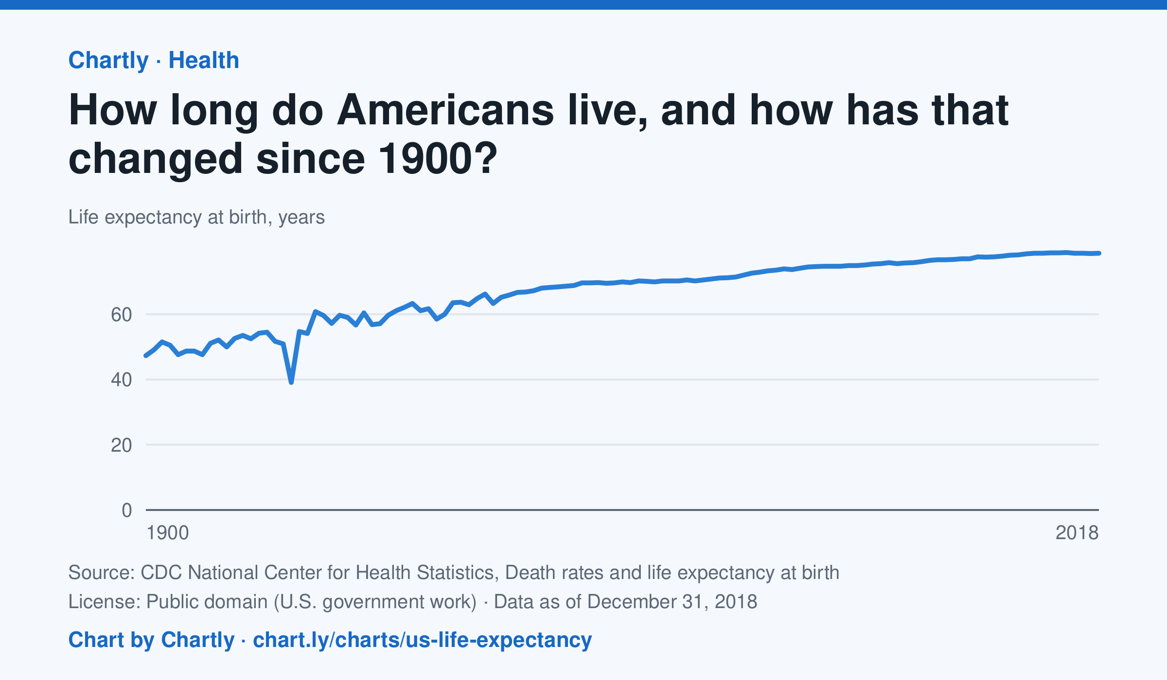
A baby born in the US in 2018 could expect to live 78.7 years, up from 47.3 in 1900. The sharpest drop was in 1918, to 39.1 years, during the influenza pandemic. This CDC dataset stops at 2018; later NCHS reports put life expectancy at 78.4 years in 2023 and 79.0 in 2024, after a fall during the COVID-19 pandemic.
Source: CDC National Center for Health Statistics, Death rates and life expectancy at birth (Public domain (U.S. government work)) · Data as of Dec 31, 2018
How to read this chart
Each point is how long a baby born in that year could expect to live, if death rates stayed as they were that year. It is an average, so it is pulled down a lot when many babies and young people die. Hover or tap a point to read its year and value.
Questions
- Find the sharpest drop on the chart. What happened in the world that year?
- Life expectancy in 1900 was under 50. Does that mean most adults died in their 40s? What else could lower the average?
- What changes in medicine, food or public health could explain the long rise?
Chart and numbers: chart.ly/charts/us-life-expectancy · More free charts at chart.ly
Chart 2 of 2 · Schools
How much does each state spend per public school student?
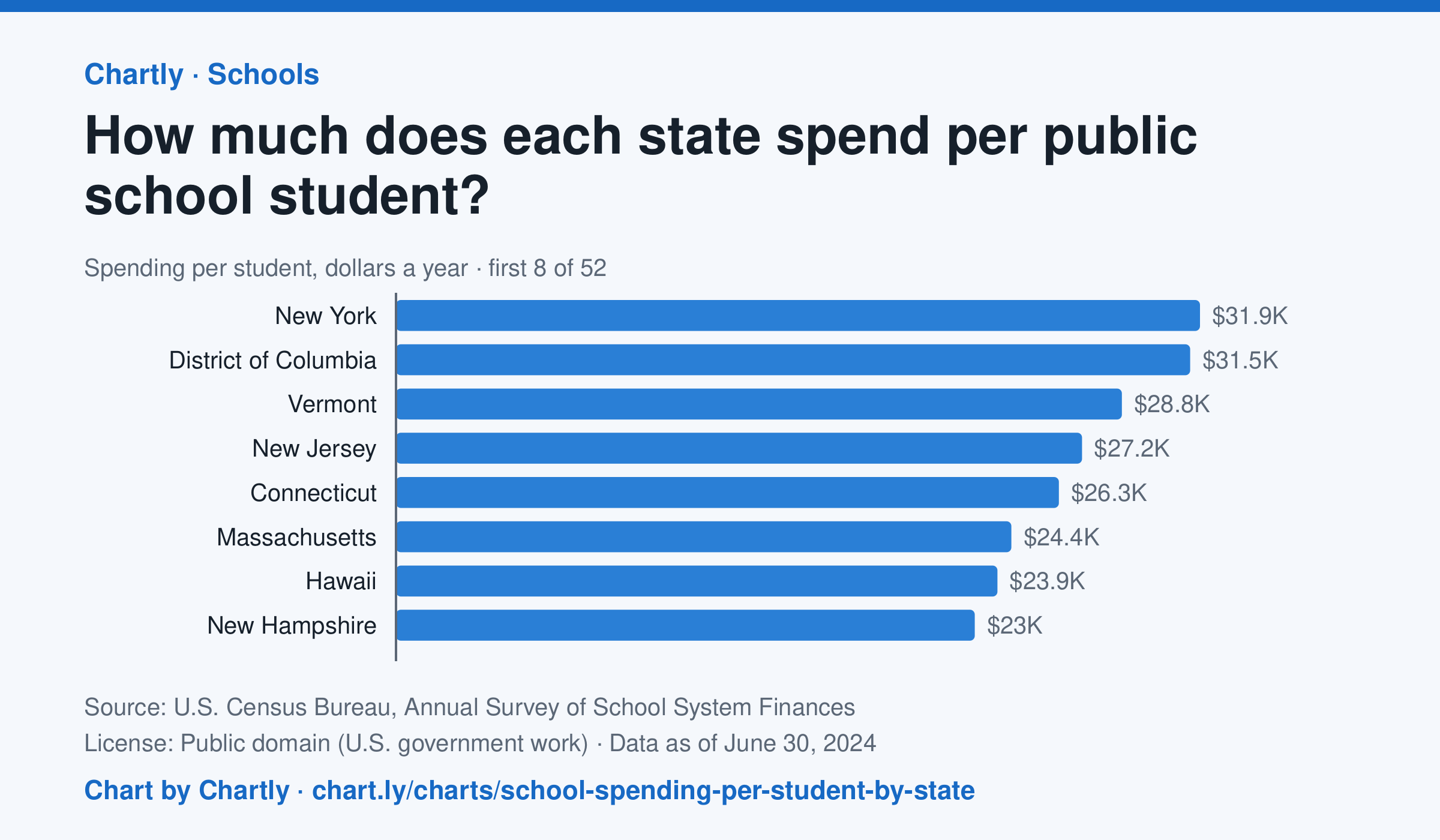
In the school year that ended in 2024, New York spent the most per public school student, $31,918, followed by District of Columbia ($31,529) and Vermont ($28,818). Idaho spent the least, $11,060, and the figure for the whole U.S. was $17,619. This is day-to-day spending on teachers, staff, supplies and buses, not on buildings or debt, and it isn't adjusted for each state's prices.
Source: U.S. Census Bureau, Annual Survey of School System Finances (Public domain (U.S. government work)) · Data as of Jun 30, 2024
How to read this chart
Each bar is how much a state's public schools spent per student in a school year, in dollars, on teachers, staff, supplies and running schools. It leaves out new buildings and debt. It is not adjusted for local prices, so a dollar goes further in some states than others. The dashed line is the U.S.
Questions
- Which state spends the most per student and which the least? How many times more is the top state?
- Where does your state rank, and is it above or below the U.S. line?
- Teachers' pay and rents cost more in some states. How could that explain part of the gap between states?
Chart and numbers: chart.ly/charts/school-spending-per-student-by-state · More free charts at chart.ly