Print this worksheet, or choose "Save as PDF" in the print window to share a file.
Chart worksheet
Charts to read and discuss
Name:
Class:
Date:
Chart 1 of 3 · Health
How long do Americans live, and how has that changed since 1900?
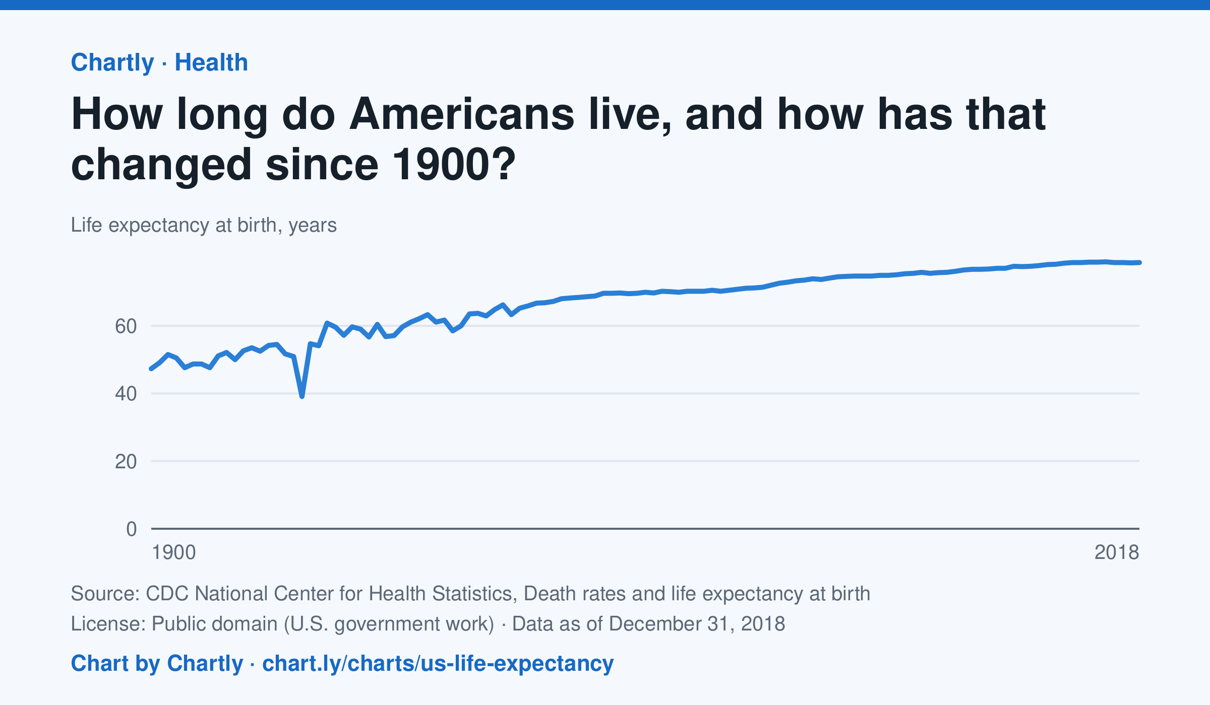
A baby born in the US in 2018 could expect to live 78.7 years, up from 47.3 in 1900. The sharpest drop was in 1918, to 39.1 years, during the influenza pandemic. This CDC dataset stops at 2018; later NCHS reports put life expectancy at 78.4 years in 2023 and 79.0 in 2024, after a fall during the COVID-19 pandemic.
Source: CDC National Center for Health Statistics, Death rates and life expectancy at birth (Public domain (U.S. government work)) · Data as of Dec 31, 2018
How to read this chart
Each point is how long a baby born in that year could expect to live, if death rates stayed as they were that year. It is an average, so it is pulled down a lot when many babies and young people die. Hover or tap a point to read its year and value.
Questions
- Find the sharpest drop on the chart. What happened in the world that year?
- Life expectancy in 1900 was under 50. Does that mean most adults died in their 40s? What else could lower the average?
- What changes in medicine, food or public health could explain the long rise?
Chart and numbers: chart.ly/charts/us-life-expectancy · More free charts at chart.ly
Chart 2 of 3 · Inflation
How much does a dozen eggs cost in the US?
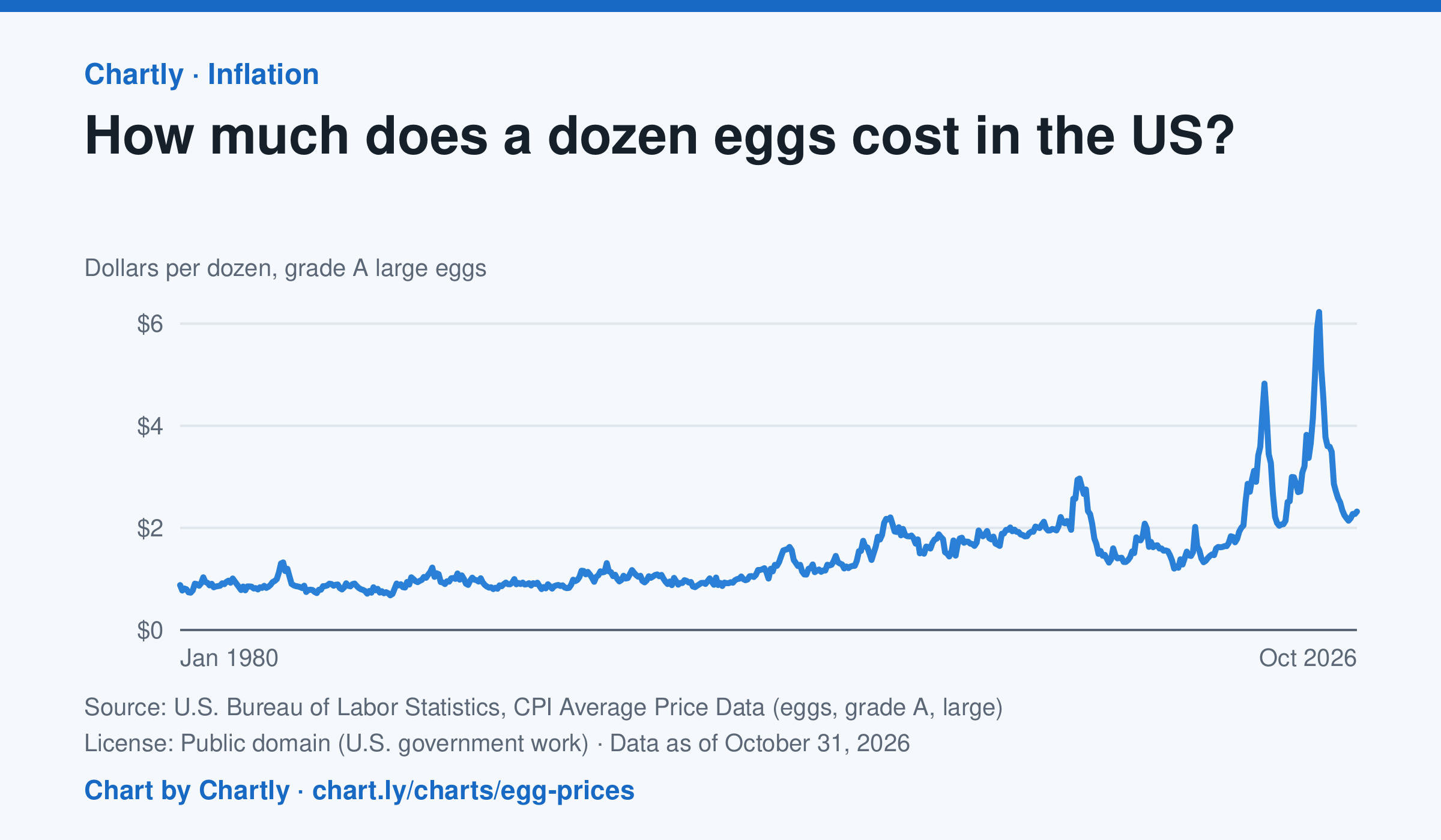
A dozen grade A large eggs averaged $2.32 in October 2026. The record so far is $6.23 in March 2025; prices spiked in 2023 and 2025 when bird flu cut the number of laying hens. Prices are BLS averages across US cities since 1980, when this series begins, in dollars of the day, not adjusted for inflation. October 2025 is missing because a lapse in federal funding stopped data collection.
Source: U.S. Bureau of Labor Statistics, CPI Average Price Data (eggs, grade A, large) (Public domain (U.S. government work)) · Data as of Oct 31, 2026
How to read this chart
Each point is the average price of a dozen grade A large eggs in U.S. cities in one month, in dollars. The axis starts at zero, so the height of the line shows the true price. Spikes often come when bird flu forces farms to lose laying hens, which cuts the supply of eggs.
Questions
- What was the highest price on the chart, and how many times more is it than the lowest?
- Showing your work, by what percent did the price change from the first month on the chart to the newest?
- When fewer hens are laying eggs but people want just as many, what happens to the price, and why?
Chart and numbers: chart.ly/charts/egg-prices · More free charts at chart.ly
Chart 3 of 3 · Jobs and wages
How many jobs did the US add each month?
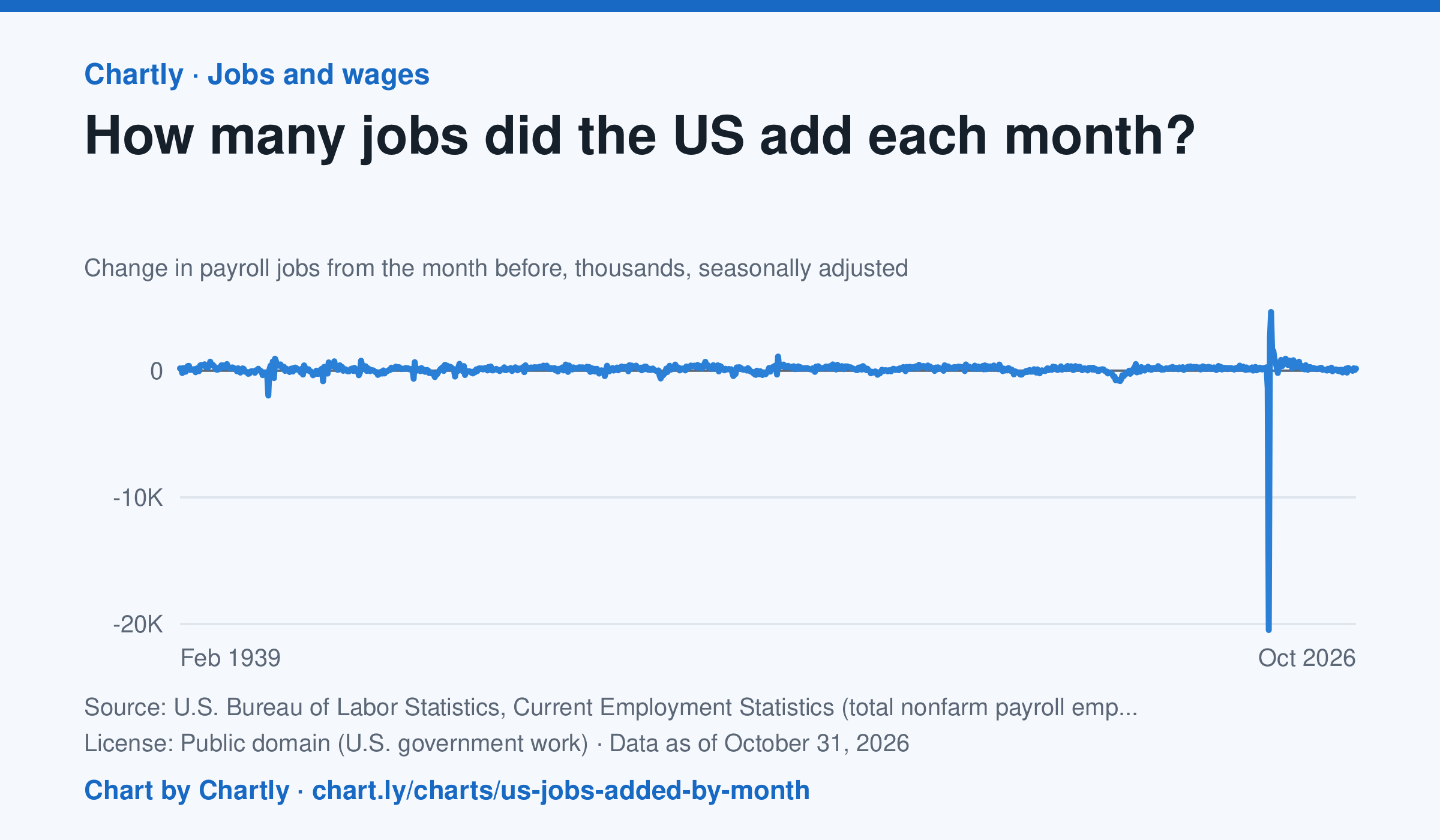
U.S. employers added 165 thousand jobs in October 2026, by the latest estimate, after adding 60 thousand in September 2026. Each point is the change in the number of jobs on payrolls from the month before, the headline figure of the monthly jobs report. Since 1939 the biggest loss was 20,469 thousand jobs in April 2020, when the pandemic closed businesses, and the biggest gain was 4,631 thousand in June 2020, as they reopened. BLS revises each month's figure in each of the next two reports as more employers answer, and once a year against unemployment insurance tax records.
Source: U.S. Bureau of Labor Statistics, Current Employment Statistics (total nonfarm payroll employment) (Public domain (U.S. government work)) · Data as of Oct 31, 2026
How to read this chart
Each point is how many jobs U.S. employers added or cut in one month, in thousands, compared with the month before. Points above zero mean more jobs; points below zero mean jobs were lost. This is the headline number of the monthly jobs report, and the newest months are estimates that get revised as more surveys come in.
Questions
- Find the lowest point on the chart. What happened that month, and how quickly did jobs come back?
- Count how many of the last 12 months were above zero. What does that tell you about the economy right now?
- Why do you think the government revises the newest months later, and why does it publish an estimate first anyway?
Chart and numbers: chart.ly/charts/us-jobs-added-by-month · More free charts at chart.ly