Print this worksheet, or choose "Save as PDF" in the print window to share a file.
Chart worksheet
Charts to read and discuss
Name:
Class:
Date:
Chart 1 of 3 · Climate
How much has the US warmed since 1895?
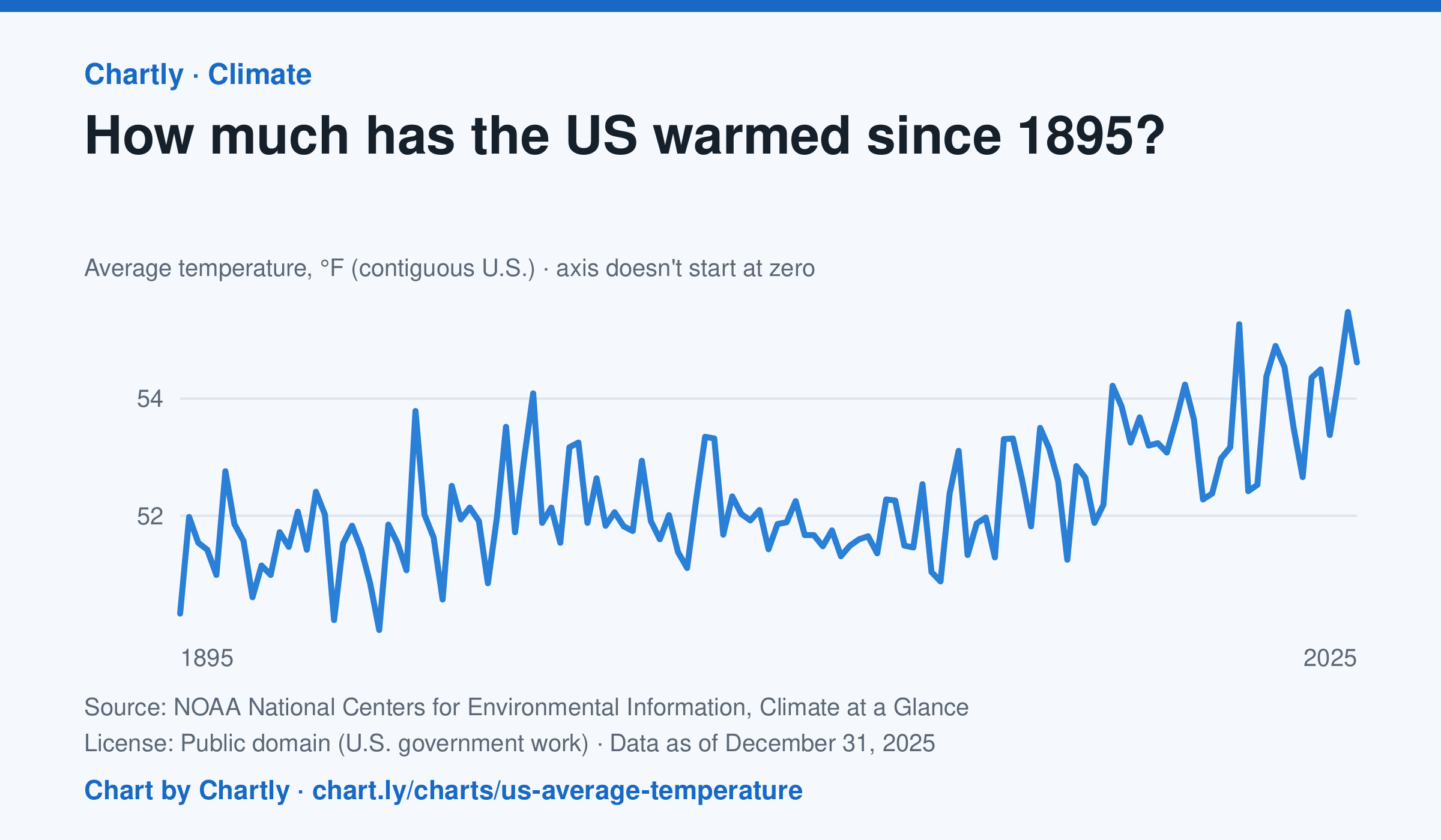
The contiguous US averaged 54.6°F in 2025. The warmest year since records began in 1895 was 2024, at 55.5°F. Through 2025, the dashed trend line, the straight line that best fits every year, rose about 0.18°F a decade, or 2.3°F since 1895, and warming had sped up to about 0.5°F a decade since 1970. Alaska and Hawaii aren't included.
Source: NOAA National Centers for Environmental Information, Climate at a Glance (Public domain (U.S. government work)) · Data as of Dec 31, 2025
How to read this chart
Each point is one year's average temperature across the lower 48 states, in degrees Fahrenheit. The axis doesn't start at zero, so a small rise looks steep: read the numbers on the axis, not the height of the line. The dashed line is the trend, the straight line that best fits every year; single years bounce above and below it.
Questions
- Find the warmest and coolest years on the chart. How many degrees apart are they?
- Why might one year be much cooler than the year before, even while the trend line keeps rising?
- The axis doesn't start at zero here, but bar charts always do. Why is that fair for temperatures but not for bars?
Chart and numbers: chart.ly/charts/us-average-temperature · More free charts at chart.ly
Chart 2 of 3 · World
How many people live in each country?
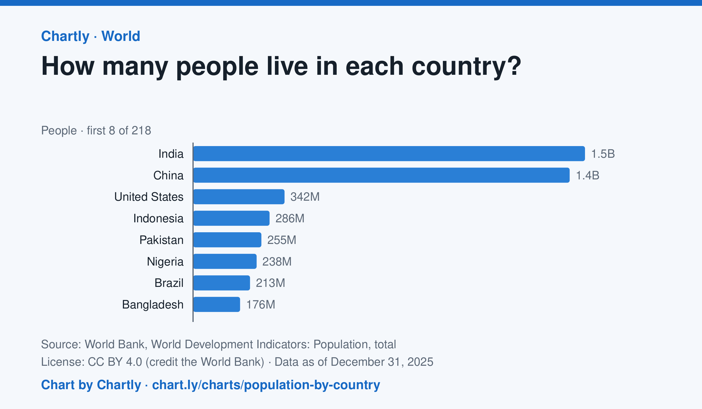
India, with 1.46 billion people in 2025, and China, with 1.41 billion, are far larger than any other country; the United States is third with 342 million. The smallest, Tuvalu, had about 9,500 people. Search 217 countries and territories. Figures are mid-year estimates, many from the United Nations.
Source: World Bank, World Development Indicators: Population, total (CC BY 4.0 (credit the World Bank)) · Data as of Dec 31, 2025
How to read this chart
Each bar is how many people lived in a country in a year, estimated by the United Nations and reported by the World Bank. On a phone the chart opens on the 10 biggest and smallest; search for any country. The bars start at zero, so a bar twice as long means twice as many people.
Questions
- Which two countries have the most people, and how far ahead are they of the third?
- About what share of the world's people live in the top two countries?
- A country with many people isn't always crowded. What other number would you need to know how crowded it is?
Chart and numbers: chart.ly/charts/population-by-country · More free charts at chart.ly
Chart 3 of 3 · Health
What do Americans die of most often?
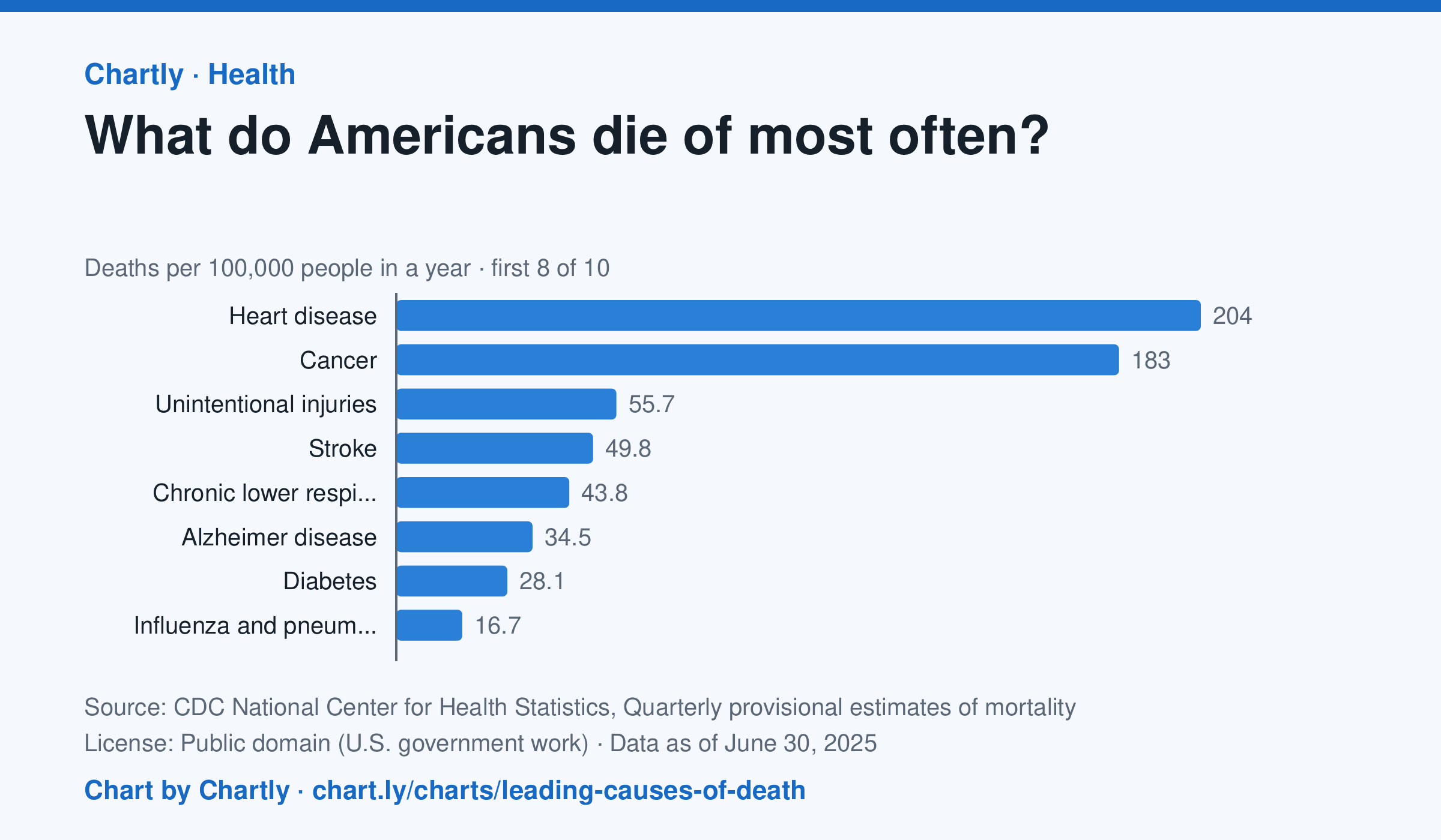
In the 12 months through June 2025, heart disease (204 deaths per 100,000 people) and cancer (183) were the leading causes of death in the US, and unintentional injuries came third at 56. Unintentional injuries include accidental overdoses, falls and traffic crashes. The numbers are provisional and may change a little as records are completed.
Source: CDC National Center for Health Statistics, Quarterly provisional estimates of mortality (Public domain (U.S. government work)) · Data as of Jun 30, 2025
How to read this chart
Each bar is how many people out of every 100,000 died of one cause in a year. A rate, instead of a count, lets you compare causes fairly even as the population grows. The bars start at zero, so a bar twice as long means twice as many deaths.
Questions
- Which two causes are far ahead of the rest? How many times bigger is the top cause than the smallest bar?
- Which of these causes could people lower with exercise, diet or not smoking?
- Why might the leading causes of death be very different for teenagers than for everyone together?
Chart and numbers: chart.ly/charts/leading-causes-of-death · More free charts at chart.ly