Print this worksheet, or choose "Save as PDF" in the print window to share a file.
Chart worksheet
Charts to read and discuss
Name:
Class:
Date:
Chart 1 of 3 · Climate
How much has the US warmed since 1895?
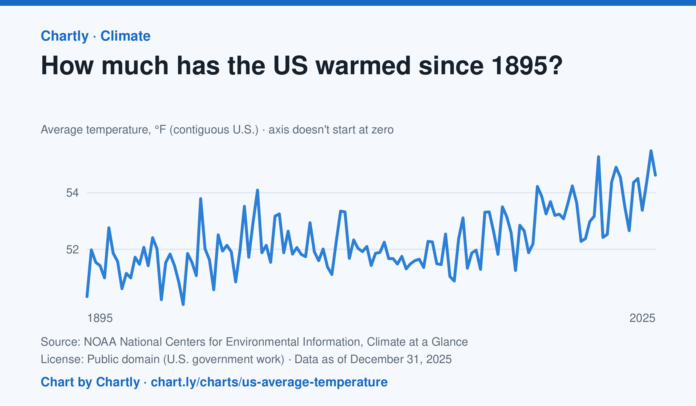
The contiguous US averaged 54.6°F in 2025. The warmest year since records began in 1895 was 2024, at 55.5°F. Through 2025, the dashed trend line, the straight line that best fits every year, rose about 0.18°F a decade, or 2.3°F since 1895, and warming had sped up to about 0.5°F a decade since 1970. Alaska and Hawaii aren't included.
Source: NOAA National Centers for Environmental Information, Climate at a Glance (Public domain (U.S. government work)) · Data as of Dec 31, 2025
How to read this chart
Each point is one year's average temperature across the lower 48 states, in degrees Fahrenheit. The axis doesn't start at zero, so a small rise looks steep: read the numbers on the axis, not the height of the line. The dashed line is the trend, the straight line that best fits every year; single years bounce above and below it.
Questions
- Find the warmest and coolest years on the chart. How many degrees apart are they?
- Why might one year be much cooler than the year before, even while the trend line keeps rising?
- The axis doesn't start at zero here, but bar charts always do. Why is that fair for temperatures but not for bars?
Chart and numbers: chart.ly/charts/us-average-temperature · More free charts at chart.ly
Chart 2 of 3 · Inflation
How much does a dozen eggs cost in the US?
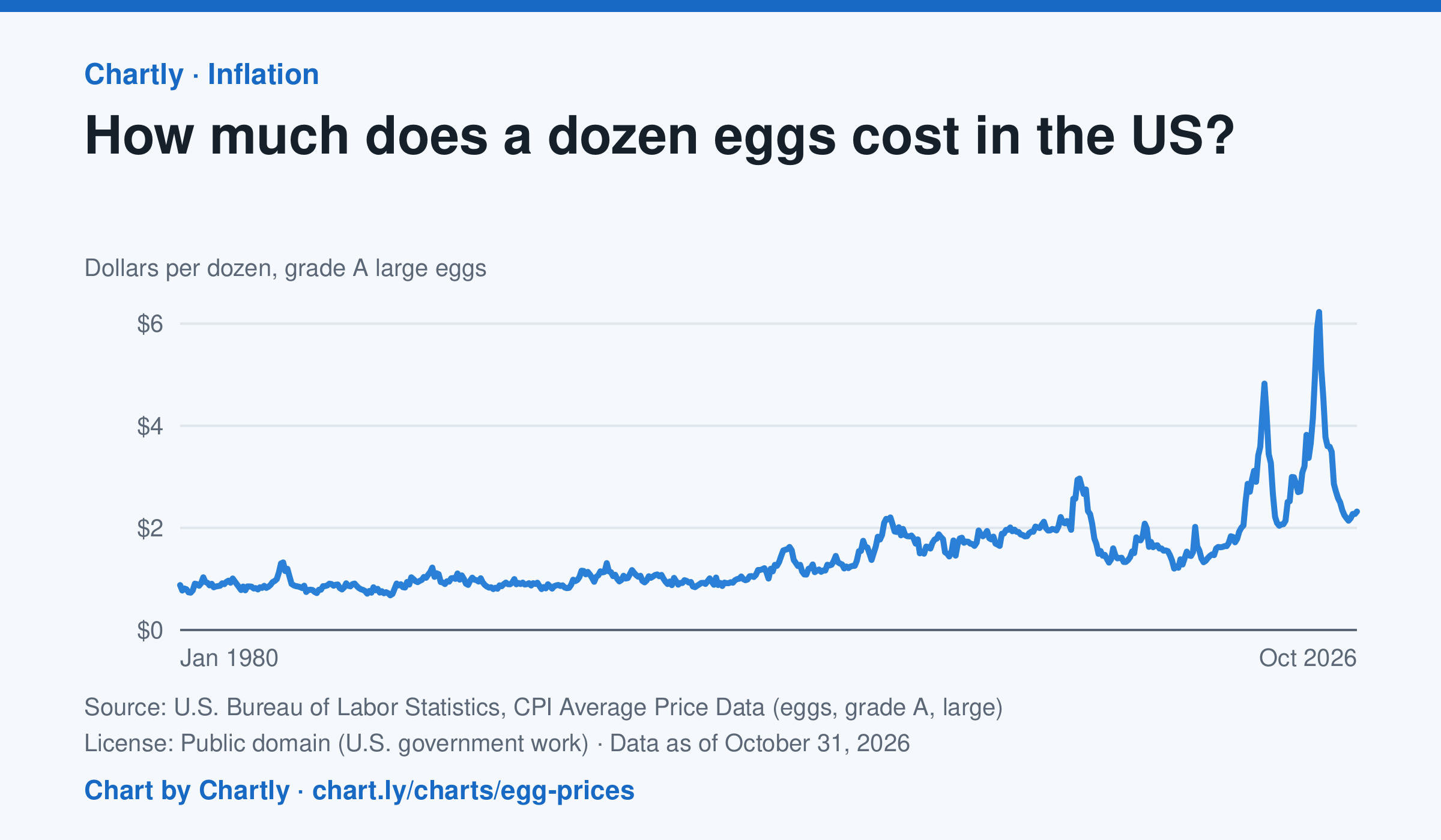
A dozen grade A large eggs averaged $2.32 in October 2026. The record so far is $6.23 in March 2025; prices spiked in 2023 and 2025 when bird flu cut the number of laying hens. Prices are BLS averages across US cities since 1980, when this series begins, in dollars of the day, not adjusted for inflation. October 2025 is missing because a lapse in federal funding stopped data collection.
Source: U.S. Bureau of Labor Statistics, CPI Average Price Data (eggs, grade A, large) (Public domain (U.S. government work)) · Data as of Oct 31, 2026
How to read this chart
Each point is the average price of a dozen grade A large eggs in U.S. cities in one month, in dollars. The axis starts at zero, so the height of the line shows the true price. Spikes often come when bird flu forces farms to lose laying hens, which cuts the supply of eggs.
Questions
- What was the highest price on the chart, and how many times more is it than the lowest?
- Showing your work, by what percent did the price change from the first month on the chart to the newest?
- When fewer hens are laying eggs but people want just as many, what happens to the price, and why?
Chart and numbers: chart.ly/charts/egg-prices · More free charts at chart.ly
Chart 3 of 3 · Wealth
How is U.S. household wealth divided?
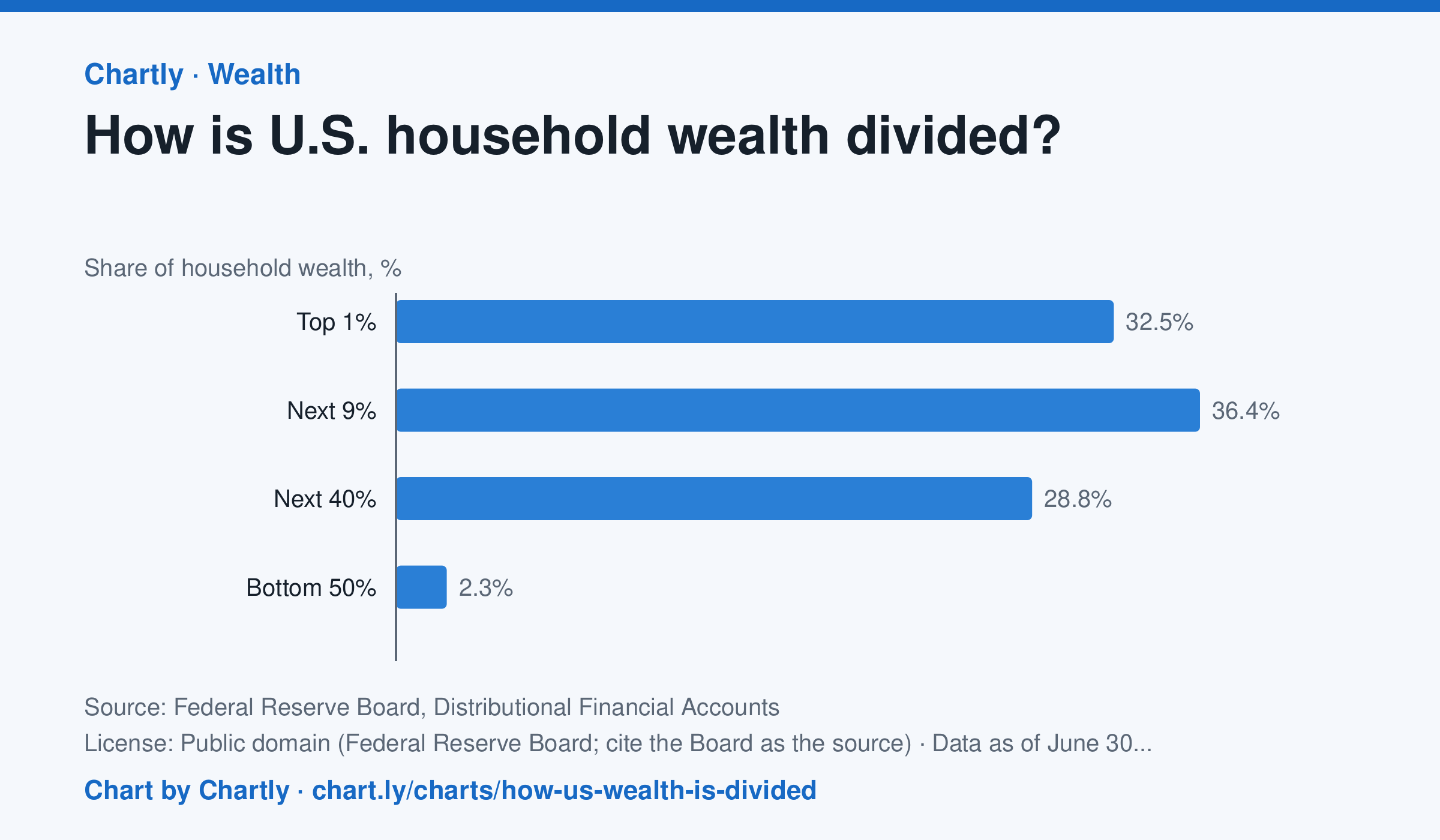
At the end of June 2026, the wealthiest 1% of U.S. households held 32.5% of all household wealth, the next 9% held 36.4%, the next 40% held 28.8% and the bottom 50% held 2.3%. In 1989 the shares were 22.8%, 38.0%, 35.7% and 3.5%. Wealth here is net worth: what households own (homes, stocks and mutual funds, pensions and retirement accounts, private businesses, cars and other belongings, bank deposits) minus what they owe (mortgages, credit cards, student and car loans). The Fed estimates each quarter by combining its Financial Accounts with its Survey of Consumer Finances, taken every three years, so the newest quarters are estimates that get revised.
Source: Federal Reserve Board, Distributional Financial Accounts (Public domain (Federal Reserve Board; cite the Board as the source)) · Data as of Jun 30, 2026
How to read this chart
Each bar is one group of U.S. households' share of all household wealth, so the four bars add up to 100%. The groups are different sizes: the top 1% is one household in every hundred, while the bottom 50% is half of all households. Compare each group's share of wealth with its share of households.
Questions
- Which group holds the largest share of wealth? Is it the group with the most households?
- If wealth were split evenly, what share would the bottom 50% hold? How far is the chart from that?
- The takeaway gives the 1989 shares too. Which groups gained a share since then, and which lost one?
Chart and numbers: chart.ly/charts/how-us-wealth-is-divided · More free charts at chart.ly