Print this worksheet, or choose "Save as PDF" in the print window to share a file.
Chart worksheet
Charts to read and discuss
Name:
Class:
Date:
Chart 1 of 3 · Climate
How much has the US warmed since 1895?
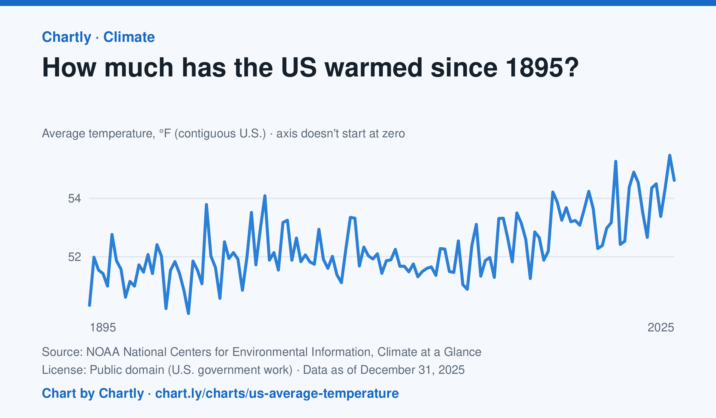
The contiguous US averaged 54.6°F in 2025. The warmest year since records began in 1895 was 2024, at 55.5°F. Through 2025, the dashed trend line, the straight line that best fits every year, rose about 0.18°F a decade, or 2.3°F since 1895, and warming had sped up to about 0.5°F a decade since 1970. Alaska and Hawaii aren't included.
Source: NOAA National Centers for Environmental Information, Climate at a Glance (Public domain (U.S. government work)) · Data as of Dec 31, 2025
How to read this chart
Each point is one year's average temperature across the lower 48 states, in degrees Fahrenheit. The axis doesn't start at zero, so a small rise looks steep: read the numbers on the axis, not the height of the line. The dashed line is the trend, the straight line that best fits every year; single years bounce above and below it.
Questions
- Find the warmest and coolest years on the chart. How many degrees apart are they?
- Why might one year be much cooler than the year before, even while the trend line keeps rising?
- The axis doesn't start at zero here, but bar charts always do. Why is that fair for temperatures but not for bars?
Chart and numbers: chart.ly/charts/us-average-temperature · More free charts at chart.ly
Chart 2 of 3 · Inflation
How much have US consumer prices risen since 1913?
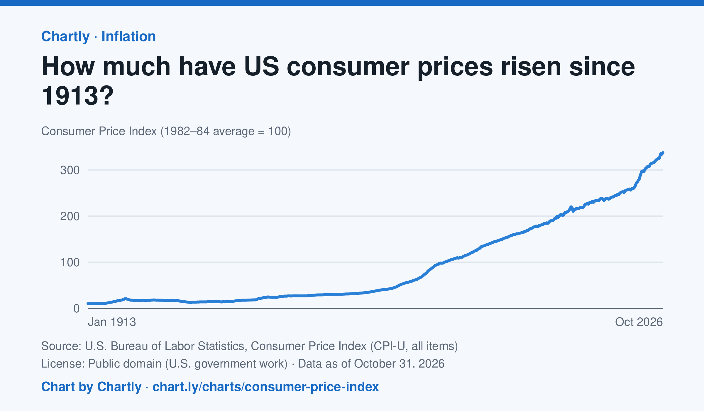
Consumer prices in October 2026 were 34 times their level in January 1913, when the Consumer Price Index begins: what cost $1 then cost about $34 in 2026. They were 2 times their level of January 2000. The index tracks what a typical basket of goods and services costs city households, with 100 as its 1982–84 average. Prices fell after 1920 and again in the early 1930s. October 2025 is missing because BLS collected no prices that month, during a lapse in federal funding.
Source: U.S. Bureau of Labor Statistics, Consumer Price Index (CPI-U, all items) (Public domain (U.S. government work)) · Data as of Oct 31, 2026
How to read this chart
The Consumer Price Index tracks the price of a fixed basket of things people buy, like food, rent, gas and clothing. It is an index, not dollars: prices in 1982 to 1984 are set to 100, so a value of 300 means the basket costs three times what it did then. Divide any two points to see how many times prices grew between them.
Questions
- How many times higher is the newest value than the first value on the chart? What does that mean for what $1 bought in 1913?
- Find a stretch where the line goes down. What does a falling index mean for prices, and when did it happen?
- Why does the government use a basket of many things instead of the price of just one item, like bread?
Chart and numbers: chart.ly/charts/consumer-price-index · More free charts at chart.ly
Chart 3 of 3 · Health
What do Americans die of most often?
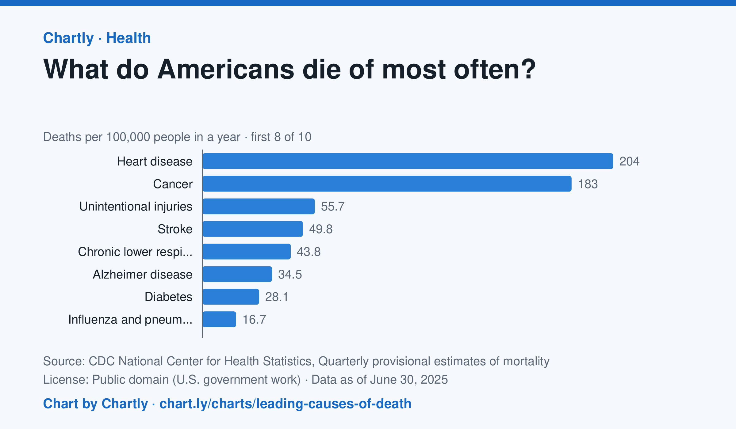
In the 12 months through June 2025, heart disease (204 deaths per 100,000 people) and cancer (183) were the leading causes of death in the US, and unintentional injuries came third at 56. Unintentional injuries include accidental overdoses, falls and traffic crashes. The numbers are provisional and may change a little as records are completed.
Source: CDC National Center for Health Statistics, Quarterly provisional estimates of mortality (Public domain (U.S. government work)) · Data as of Jun 30, 2025
How to read this chart
Each bar is how many people out of every 100,000 died of one cause in a year. A rate, instead of a count, lets you compare causes fairly even as the population grows. The bars start at zero, so a bar twice as long means twice as many deaths.
Questions
- Which two causes are far ahead of the rest? How many times bigger is the top cause than the smallest bar?
- Which of these causes could people lower with exercise, diet or not smoking?
- Why might the leading causes of death be very different for teenagers than for everyone together?
Chart and numbers: chart.ly/charts/leading-causes-of-death · More free charts at chart.ly