Print this worksheet, or choose "Save as PDF" in the print window to share a file.
Chart worksheet
Charts to read and discuss
Name:
Class:
Date:
Chart 1 of 2 · Crime
Which big U.S. cities have the highest murder rates?
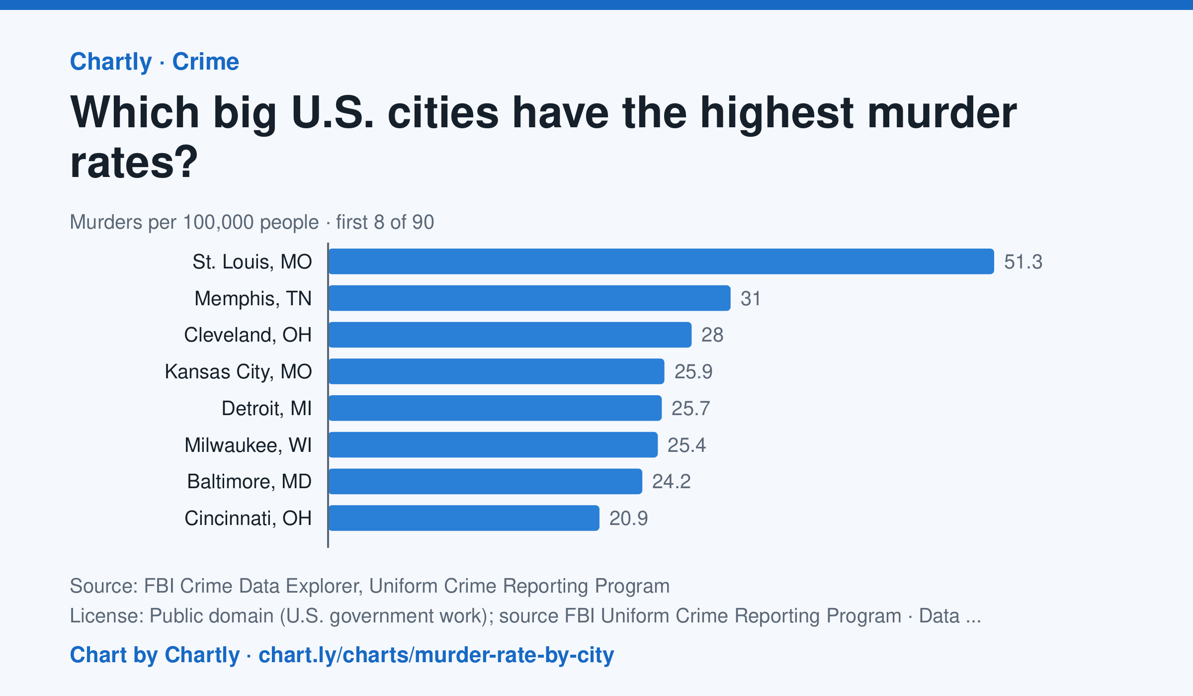
In 2025 St. Louis, MO had the highest murder rate of the 89 biggest U.S. cities whose police reported a full year to the FBI, about 51.3 per 100,000 people, followed by Memphis, TN (31.0) and Cleveland, OH (28.0). Irvine, CA (0.0) and Plano, TX (0.7) had the lowest; the U.S. rate was about 4.4. Departments that didn't report a full year are left out (for 2025, New Orleans, Orlando and St. Petersburg, Florida). Each rate is per person the department serves, and a few, such as Las Vegas, Honolulu, Jacksonville and Louisville, serve their whole county. A city's rate also depends on where its borders fall, so compare cities with care.
Source: FBI Crime Data Explorer, Uniform Crime Reporting Program (Public domain (U.S. government work); source FBI Uniform Crime Reporting Program) · Data as of Dec 31, 2025
How to read this chart
Each bar is the number of murders in a city in one year for every 100,000 people its police department serves. The dashed line is the U.S. rate. Murders are rare, so in a smaller city a handful more or fewer in one year can move its rate and its rank a lot.
Questions
- How many cities on the chart have a murder rate above the U.S. rate, and how many are below it?
- Why does a chart like this use murders per 100,000 people instead of the total number of murders in each city?
- A city's rank can jump from one year to the next. Why might small numbers make rates bounce around?
Chart and numbers: chart.ly/charts/murder-rate-by-city · More free charts at chart.ly
Chart 2 of 2 · Federal budget
Where does federal spending go?
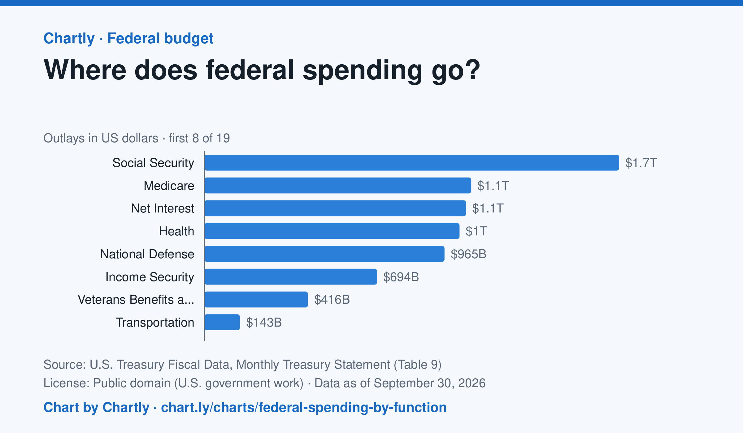
Social Security was the biggest item in fiscal 2026 at $1.67 trillion, out of $7.4 trillion in total. Next came Medicare ($1.07 trillion), Net Interest ($1.05 trillion), Health ($1.03 trillion) and National Defense ($965 billion). Two accounting lines are below zero, so the bars add up to the total.
Source: U.S. Treasury Fiscal Data, Monthly Treasury Statement (Table 9) (Public domain (U.S. government work)) · Data as of Sep 30, 2026
How to read this chart
Each bar is how much the federal government spent on one area in a fiscal year, which runs from October to September. The axis shows dollars: 1T is a trillion dollars, a thousand billion. One bar is below zero because it counts money the government takes back in, such as payments agencies make to each other, which lowers the total.
Questions
- Which area gets the most money? About how many times more than the smallest positive bar?
- Which of the biggest areas are paid to people directly, like retirees and patients, and which pay for services?
- If Congress wanted to cut spending by a lot, which bars would it have to change, and why is that hard?
Chart and numbers: chart.ly/charts/federal-spending-by-function · More free charts at chart.ly