Print this worksheet, or choose "Save as PDF" in the print window to share a file.
Chart worksheet
Charts to read and discuss
Name:
Class:
Date:
Chart 1 of 2 · Wealth
How is U.S. household wealth divided?
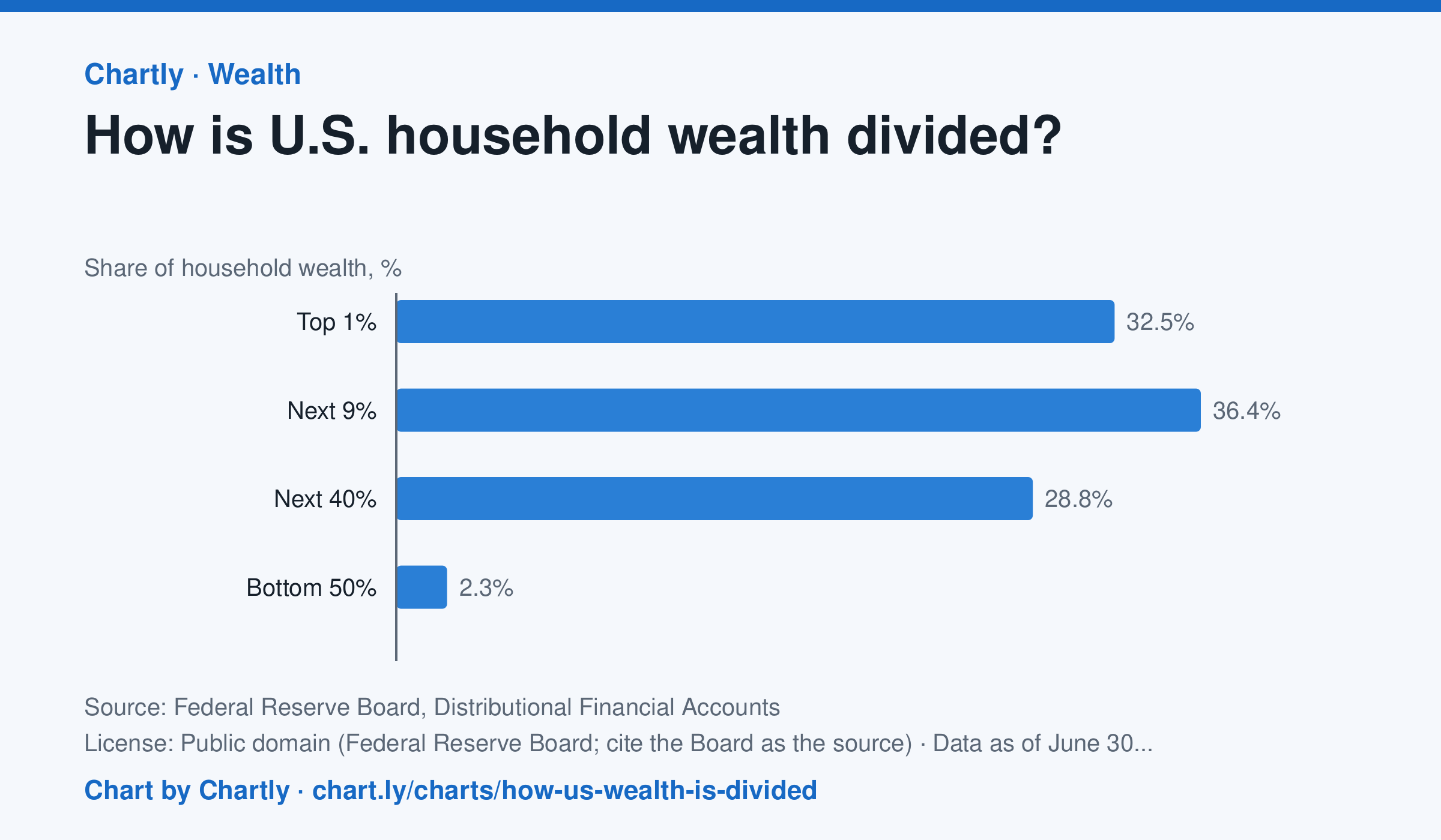
At the end of June 2026, the wealthiest 1% of U.S. households held 32.5% of all household wealth, the next 9% held 36.4%, the next 40% held 28.8% and the bottom 50% held 2.3%. In 1989 the shares were 22.8%, 38.0%, 35.7% and 3.5%. Wealth here is net worth: what households own (homes, stocks and mutual funds, pensions and retirement accounts, private businesses, cars and other belongings, bank deposits) minus what they owe (mortgages, credit cards, student and car loans). The Fed estimates each quarter by combining its Financial Accounts with its Survey of Consumer Finances, taken every three years, so the newest quarters are estimates that get revised.
Source: Federal Reserve Board, Distributional Financial Accounts (Public domain (Federal Reserve Board; cite the Board as the source)) · Data as of Jun 30, 2026
How to read this chart
Each bar is one group of U.S. households' share of all household wealth, so the four bars add up to 100%. The groups are different sizes: the top 1% is one household in every hundred, while the bottom 50% is half of all households. Compare each group's share of wealth with its share of households.
Questions
- Which group holds the largest share of wealth? Is it the group with the most households?
- If wealth were split evenly, what share would the bottom 50% hold? How far is the chart from that?
- The takeaway gives the 1989 shares too. Which groups gained a share since then, and which lost one?
Chart and numbers: chart.ly/charts/how-us-wealth-is-divided · More free charts at chart.ly
Chart 2 of 2 · Housing
How much is rent in each state?
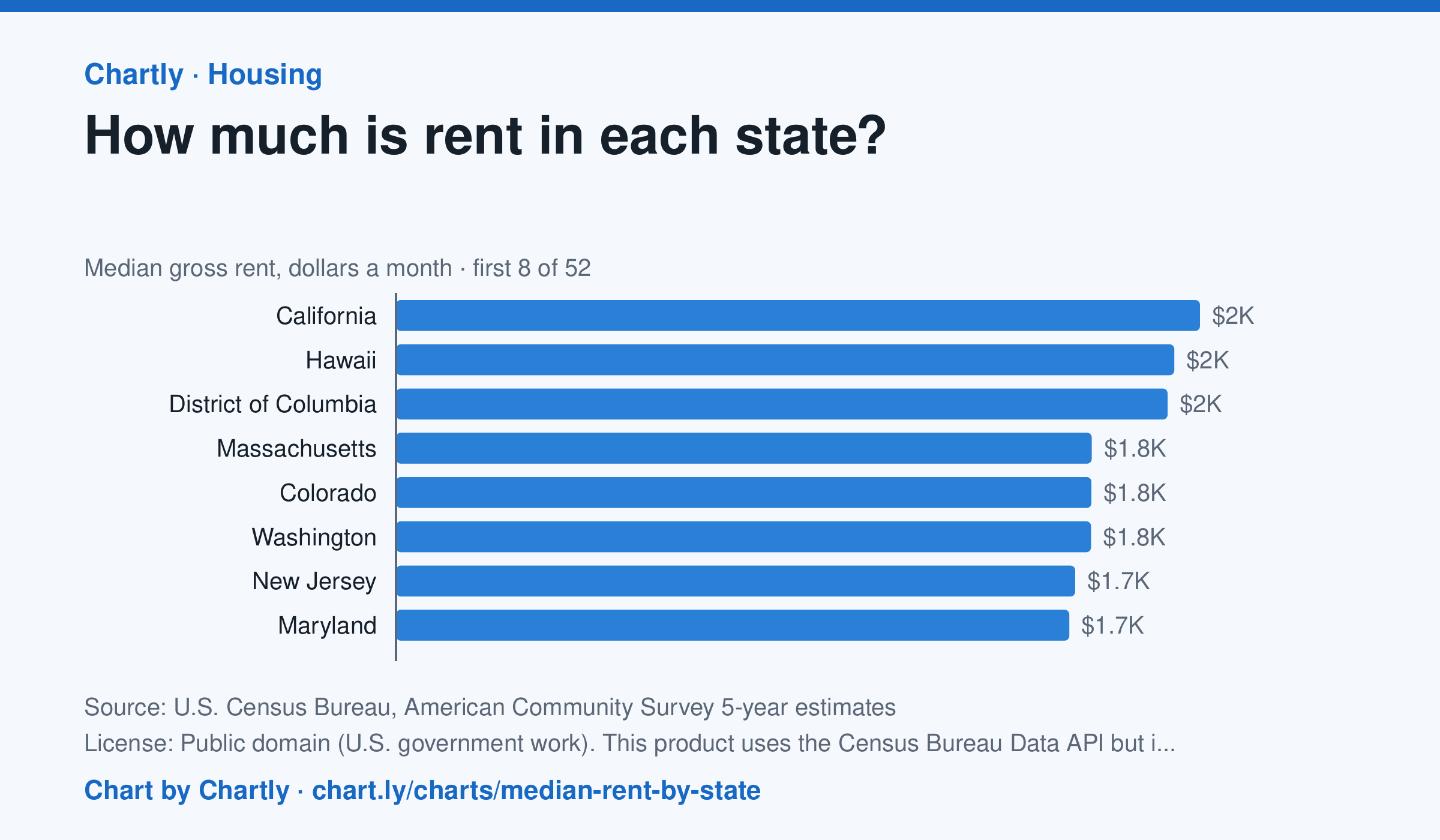
In the Census Bureau's 5-year survey ending in 2024, median rent including utilities was highest in California, $2,036 a month, followed by Hawaii ($1,971) and District of Columbia ($1,954). West Virginia was lowest at $872, and the U.S. median was $1,413. Averaged over five years, these figures trail the latest rent increases.
Source: U.S. Census Bureau, American Community Survey 5-year estimates (Public domain (U.S. government work). This product uses the Census Bureau Data API but is not endorsed or certified by the Census Bureau.) · Data as of Dec 31, 2024
How to read this chart
Each bar is the median monthly rent, including utilities, in a state: half of renters pay more and half pay less. The figures come from a Census survey of a sample of homes, so each has a margin of error, shown as a thin line and a ± figure. The dashed line is the whole U.S.
Questions
- Which state has the highest median rent and which the lowest? How many times more is the highest?
- Why is a median a better way to describe typical rent than an average, when a few apartments cost a huge amount?
- Two states' rents are only a few dollars apart and their margins of error overlap. Can you say which one is really higher?
Chart and numbers: chart.ly/charts/median-rent-by-state · More free charts at chart.ly