Print this worksheet, or choose "Save as PDF" in the print window to share a file.
Chart worksheet
Charts to read and discuss
Name:
Class:
Date:
Chart 1 of 2 · Federal budget
Where does federal spending go?
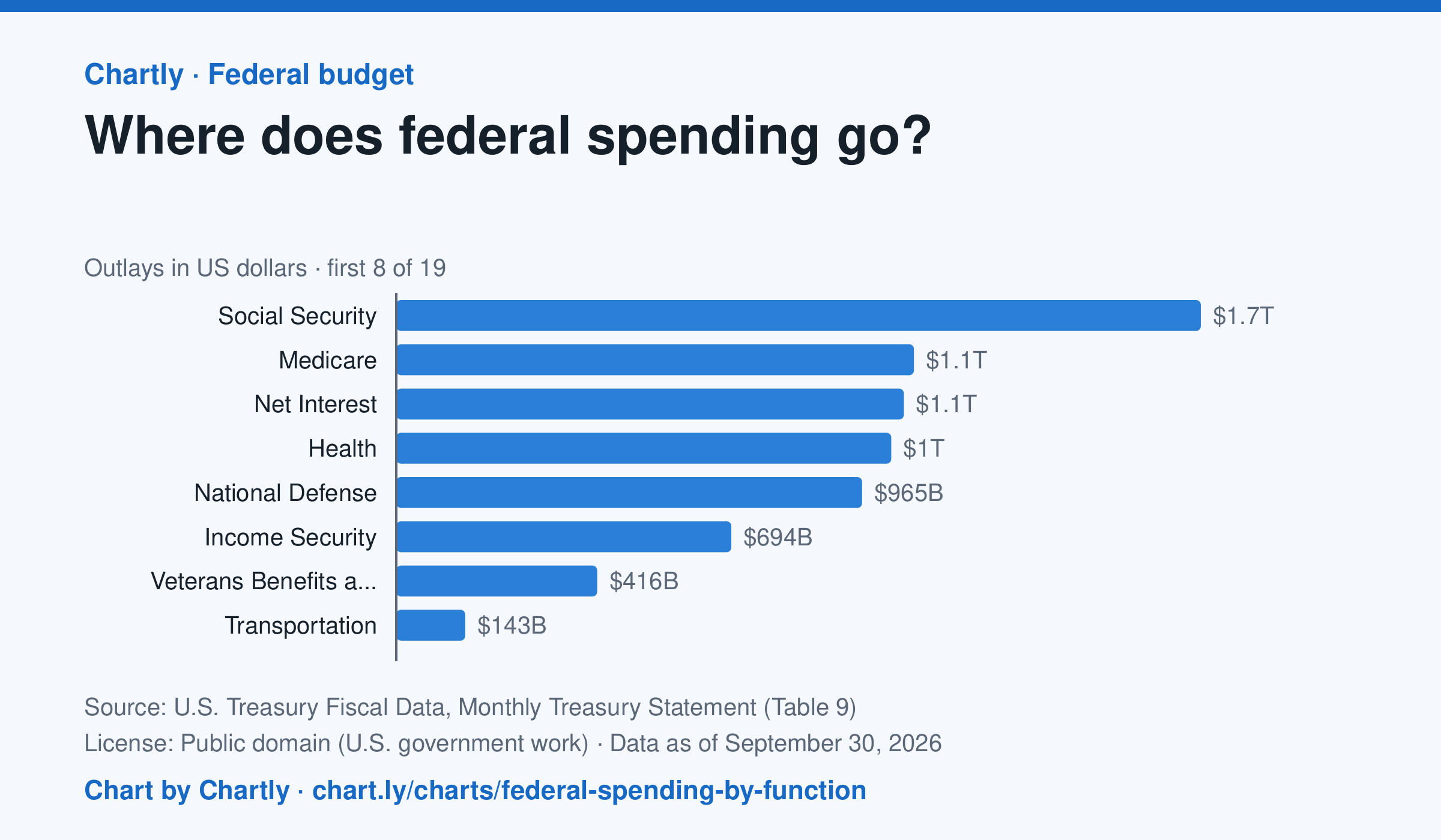
Social Security was the biggest item in fiscal 2026 at $1.67 trillion, out of $7.4 trillion in total. Next came Medicare ($1.07 trillion), Net Interest ($1.05 trillion), Health ($1.03 trillion) and National Defense ($965 billion). Two accounting lines are below zero, so the bars add up to the total.
Source: U.S. Treasury Fiscal Data, Monthly Treasury Statement (Table 9) (Public domain (U.S. government work)) · Data as of Sep 30, 2026
How to read this chart
Each bar is how much the federal government spent on one area in a fiscal year, which runs from October to September. The axis shows dollars: 1T is a trillion dollars, a thousand billion. One bar is below zero because it counts money the government takes back in, such as payments agencies make to each other, which lowers the total.
Questions
- Which area gets the most money? About how many times more than the smallest positive bar?
- Which of the biggest areas are paid to people directly, like retirees and patients, and which pay for services?
- If Congress wanted to cut spending by a lot, which bars would it have to change, and why is that hard?
Chart and numbers: chart.ly/charts/federal-spending-by-function · More free charts at chart.ly
Chart 2 of 2 · World
How many people live in each country?
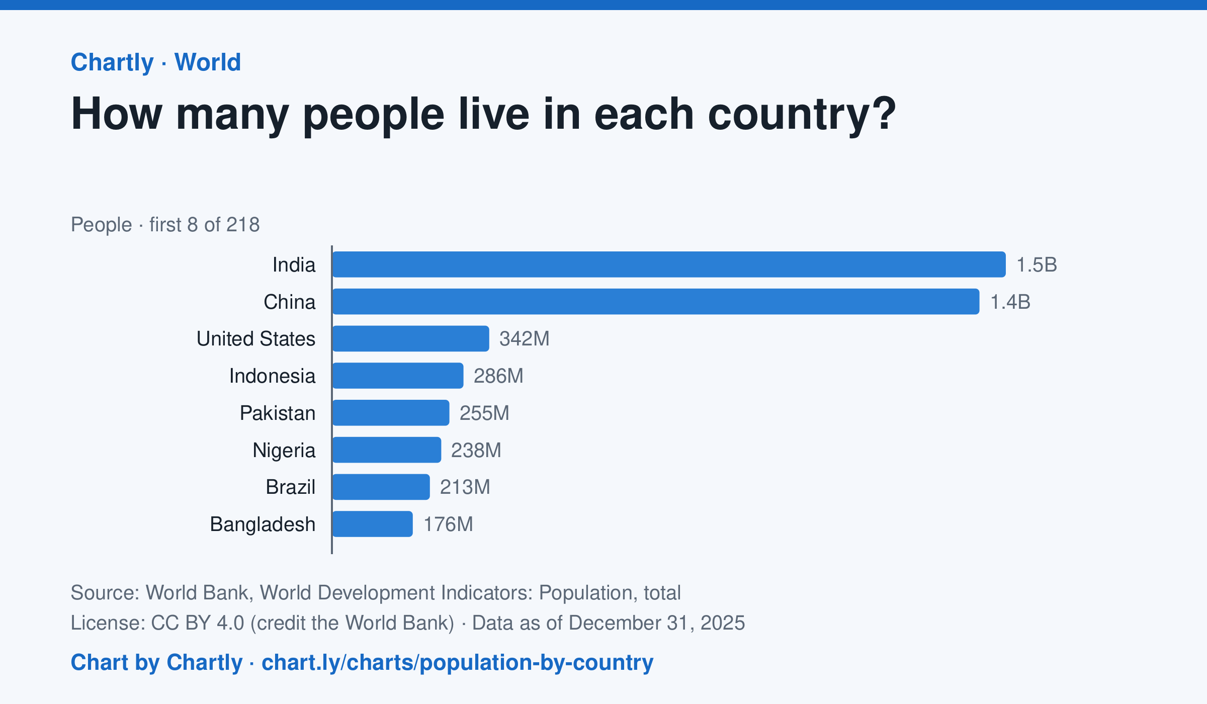
India, with 1.46 billion people in 2025, and China, with 1.41 billion, are far larger than any other country; the United States is third with 342 million. The smallest, Tuvalu, had about 9,500 people. Search 217 countries and territories. Figures are mid-year estimates, many from the United Nations.
Source: World Bank, World Development Indicators: Population, total (CC BY 4.0 (credit the World Bank)) · Data as of Dec 31, 2025
How to read this chart
Each bar is how many people lived in a country in a year, estimated by the United Nations and reported by the World Bank. On a phone the chart opens on the 10 biggest and smallest; search for any country. The bars start at zero, so a bar twice as long means twice as many people.
Questions
- Which two countries have the most people, and how far ahead are they of the third?
- About what share of the world's people live in the top two countries?
- A country with many people isn't always crowded. What other number would you need to know how crowded it is?
Chart and numbers: chart.ly/charts/population-by-country · More free charts at chart.ly