Print this worksheet, or choose "Save as PDF" in the print window to share a file.
Chart worksheet
Charts to read and discuss
Name:
Class:
Date:
Chart 1 of 3 · Federal budget
Where does federal revenue come from?
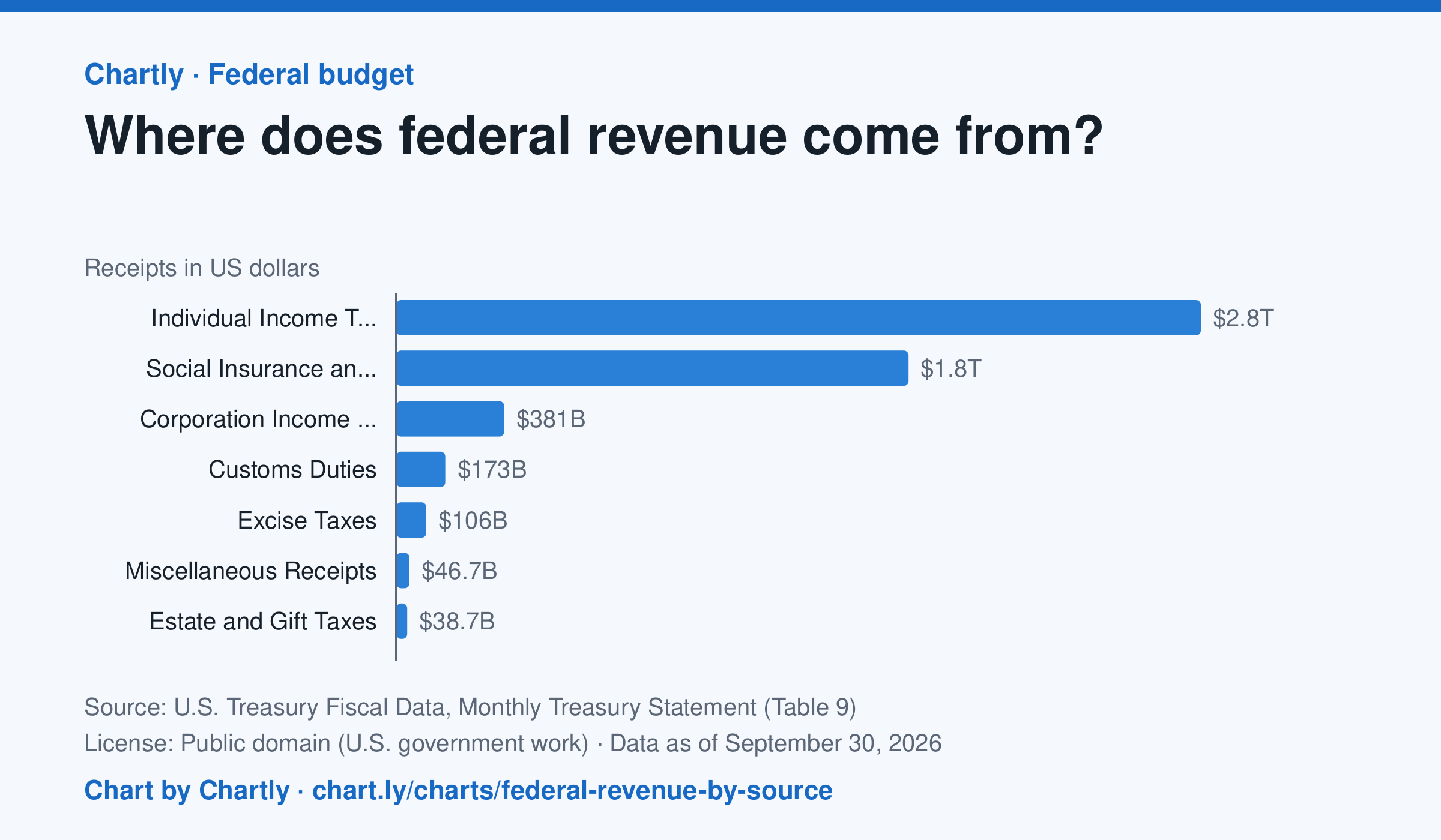
Individual income taxes brought in $2.85 trillion of the government's $5.4 trillion in fiscal 2026, about 53%. Payroll taxes for Social Security, Medicare and unemployment insurance ("social insurance") added $1.81 trillion, and corporate income taxes $381 billion.
Source: U.S. Treasury Fiscal Data, Monthly Treasury Statement (Table 9) (Public domain (U.S. government work)) · Data as of Sep 30, 2026
How to read this chart
Each bar is how much money the federal government collected from one kind of tax in a fiscal year, which runs from October to September. Payroll taxes are the Social Security and Medicare taxes taken out of paychecks. The axis shows dollars: 1T is a trillion dollars.
Questions
- Which source brings in the most money? About what share of the total is it?
- How are individual income taxes different from payroll taxes? Who pays each one?
- Compare this chart with the federal spending chart. What happens when the government spends more than it collects?
Chart and numbers: chart.ly/charts/federal-revenue-by-source · More free charts at chart.ly
Chart 2 of 3 · Jobs and wages
How much do US workers earn an hour?
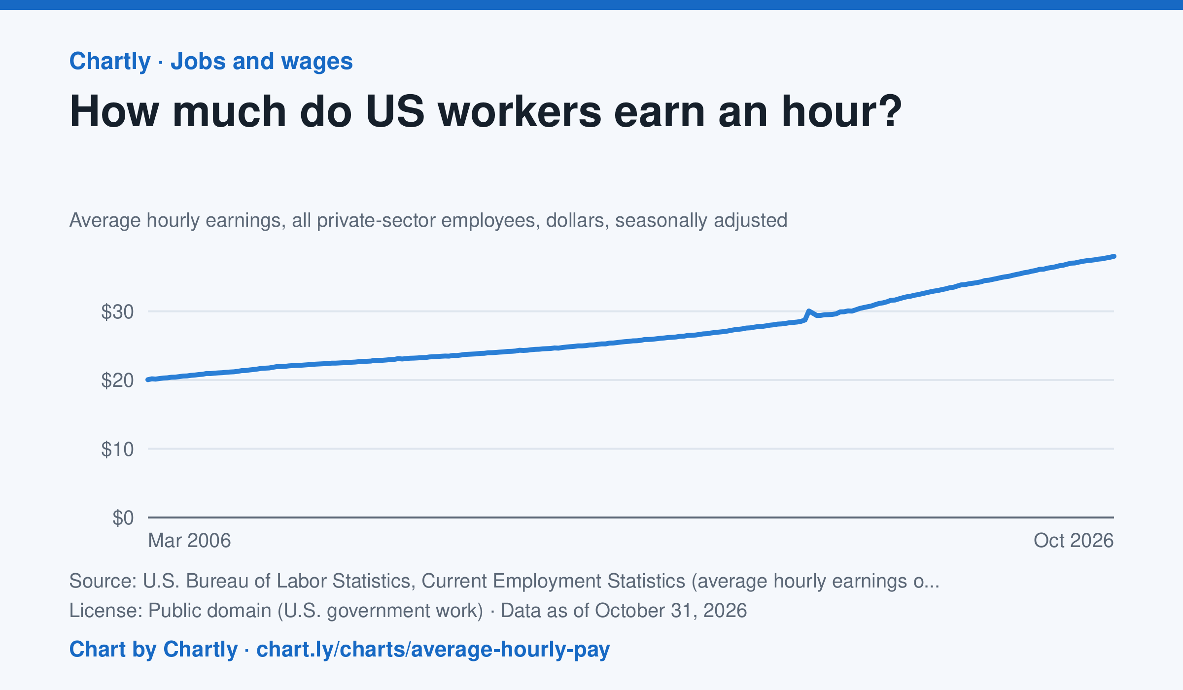
Private-sector employees earned an average of $38.00 an hour in October 2026, 3.1% more than in October 2025 and 1.9 times the $20.04 of March 2006, when the series begins. That is in dollars of the day, not adjusted for inflation; the monthly jobs report compares it with prices. The average rose sharply in spring 2020 because the pandemic put mostly lower-paid people out of work, not because pay jumped.
Source: U.S. Bureau of Labor Statistics, Current Employment Statistics (average hourly earnings of all employees, total private) (Public domain (U.S. government work)) · Data as of Oct 31, 2026
How to read this chart
Each point is the average hourly pay of private-sector employees in one month, in dollars, before taxes. It is not adjusted for inflation, so a rise in pay doesn't always mean workers can buy more. Hover or tap a point to read its month and value.
Questions
- How much did average hourly pay change from the first month on the chart to the newest?
- Find a month when pay jumped more than usual. Can you think of a reason that might happen, other than everyone getting a raise?
- If prices rose faster than pay over a year, were workers better or worse off? How could you check that with another chart?
Chart and numbers: chart.ly/charts/average-hourly-pay · More free charts at chart.ly
Chart 3 of 3 · Health
How has the US teen birth rate changed since 1940?
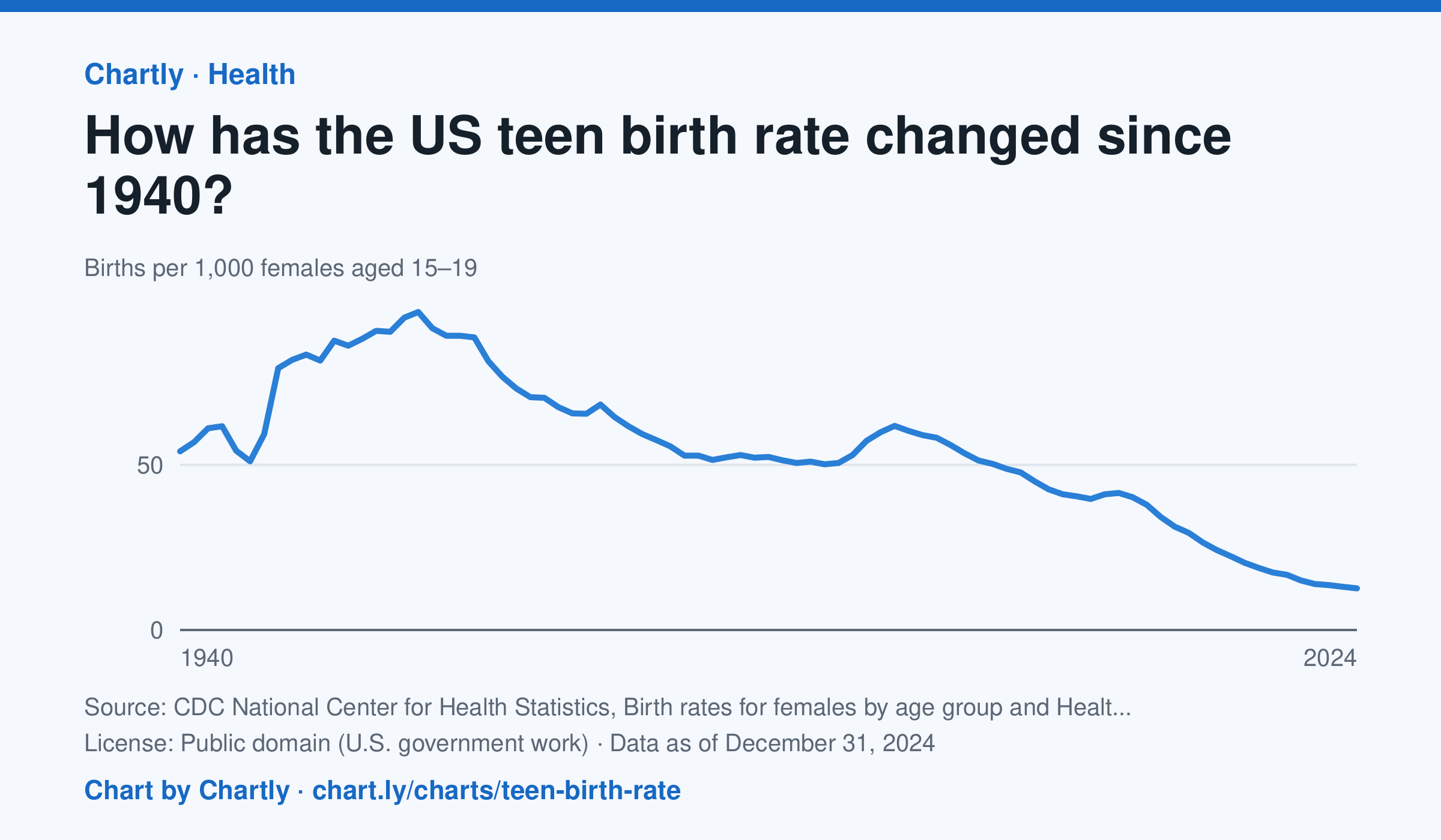
There were 12.6 births per 1,000 females aged 15 to 19 in 2024. The rate has fallen about 80% since 1991 (61.8) and about 87% since its 1957 peak (96.3).
Source: CDC National Center for Health Statistics, Birth rates for females by age group and Health, United States (Public domain (U.S. government work)) · Data as of Dec 31, 2024
How to read this chart
Each point is how many babies were born in a year for every 1,000 young women aged 15 to 19. A rate is used instead of a count so that years with more or fewer teenagers can be compared fairly. Hover or tap a point to read its year and value.
Questions
- When was the teen birth rate highest, and what is it in the newest year?
- Showing your work, by about what percent has the rate fallen since its peak?
- What changes in schools, health care or society could explain the long fall since the early 1990s?
Chart and numbers: chart.ly/charts/teen-birth-rate · More free charts at chart.ly