Print this worksheet, or choose "Save as PDF" in the print window to share a file.
Chart worksheet
Charts to read and discuss
Name:
Class:
Date:
Chart 1 of 3 · Inflation
How much does a dozen eggs cost in the US?
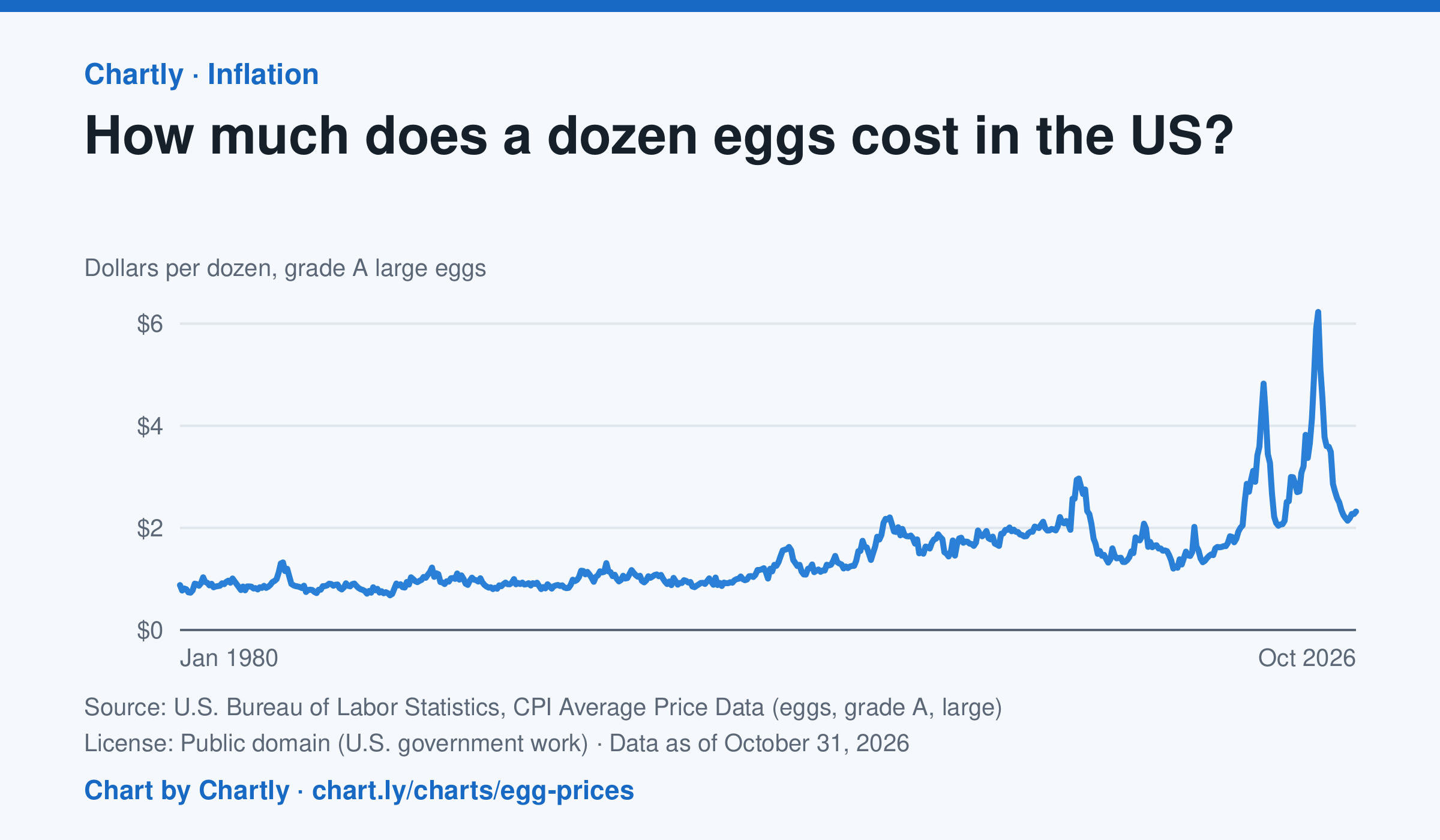
A dozen grade A large eggs averaged $2.32 in October 2026. The record so far is $6.23 in March 2025; prices spiked in 2023 and 2025 when bird flu cut the number of laying hens. Prices are BLS averages across US cities since 1980, when this series begins, in dollars of the day, not adjusted for inflation. October 2025 is missing because a lapse in federal funding stopped data collection.
Source: U.S. Bureau of Labor Statistics, CPI Average Price Data (eggs, grade A, large) (Public domain (U.S. government work)) · Data as of Oct 31, 2026
How to read this chart
Each point is the average price of a dozen grade A large eggs in U.S. cities in one month, in dollars. The axis starts at zero, so the height of the line shows the true price. Spikes often come when bird flu forces farms to lose laying hens, which cuts the supply of eggs.
Questions
- What was the highest price on the chart, and how many times more is it than the lowest?
- Showing your work, by what percent did the price change from the first month on the chart to the newest?
- When fewer hens are laying eggs but people want just as many, what happens to the price, and why?
Chart and numbers: chart.ly/charts/egg-prices · More free charts at chart.ly
Chart 2 of 3 · Jobs and wages
What is the US unemployment rate?
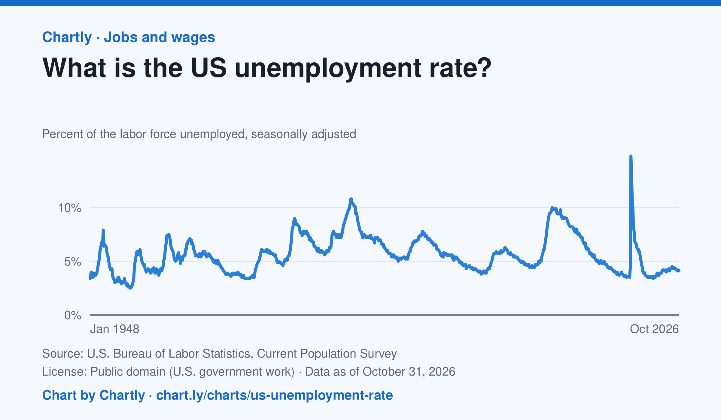
4.1% of the US labor force was unemployed in October 2026, against 4.4% in September 2025. Since the monthly rate began in 1948 it peaked at 14.8% in April 2020, at the start of the pandemic, and was lowest at 2.5% in May 1953. October 2025 is missing because a lapse in federal funding stopped the survey.
Source: U.S. Bureau of Labor Statistics, Current Population Survey (Public domain (U.S. government work)) · Data as of Oct 31, 2026
How to read this chart
Each point is the share of the labor force without a job in one month: people who have no work, are available and looked for a job in the past four weeks. People who aren't looking, such as retirees and most students, aren't in the labor force, so they don't count as unemployed. The numbers are seasonally adjusted, so the usual jump when school ends doesn't show up as bad news.
Questions
- Find the three highest peaks on the chart. What was happening in the economy at each one?
- How long did it take the rate to come back down after each peak? Was the recovery faster or slower than the rise?
- Someone who gives up looking for work stops counting as unemployed. How could that make the rate look better than things really are?
Chart and numbers: chart.ly/charts/us-unemployment-rate · More free charts at chart.ly
Chart 3 of 3 · Road safety
Are U.S. roads getting safer per mile driven?
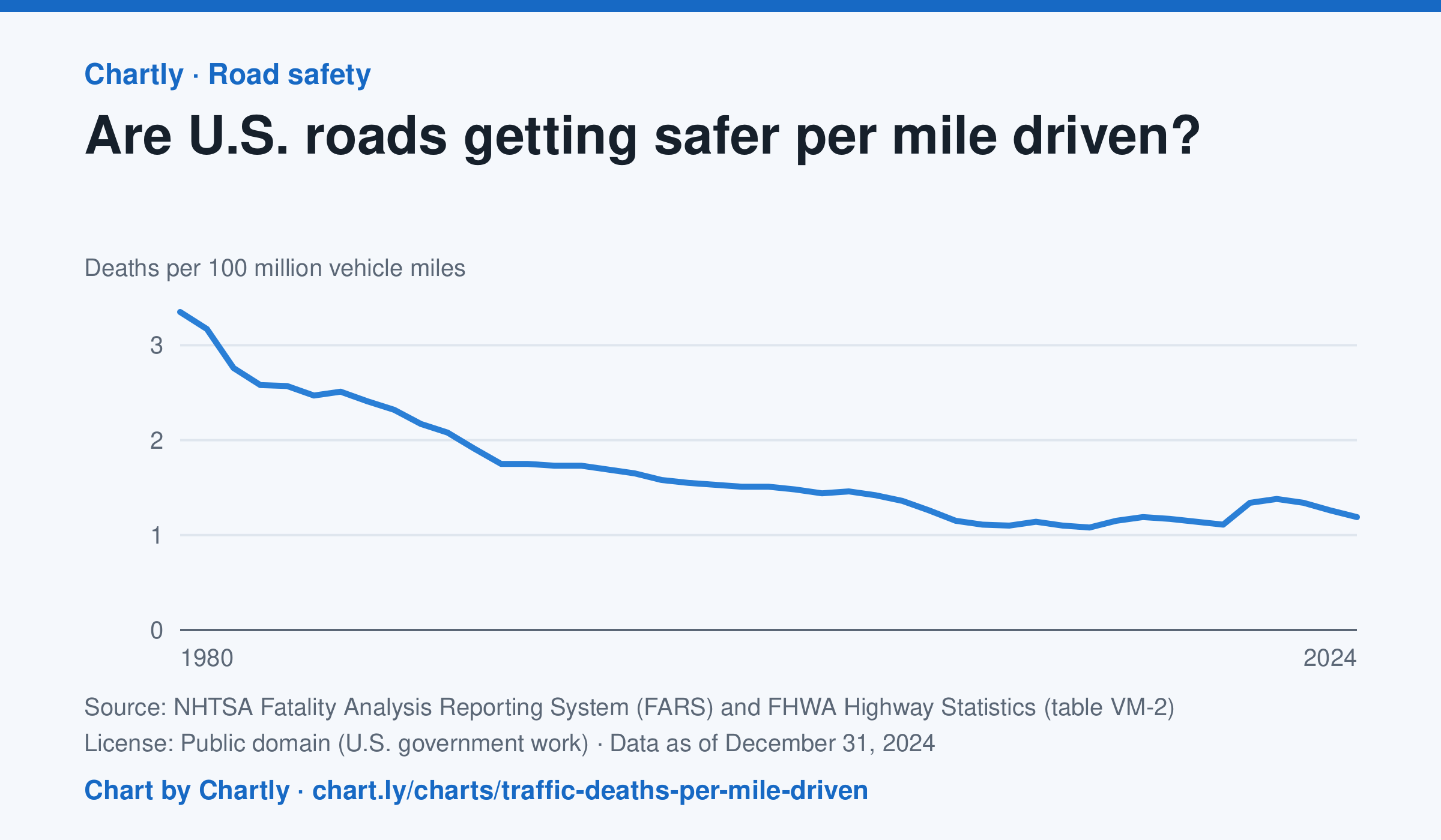
In 2024 there were 1.19 deaths for every 100 million miles driven, down from 3.35 in 1980. The lowest rate was 1.08 in 2014; it jumped to 1.34 in 2020, when people drove less but deaths rose. Miles driven are the Federal Highway Administration's estimates.
Source: NHTSA Fatality Analysis Reporting System (FARS) and FHWA Highway Statistics (table VM-2) (Public domain (U.S. government work)) · Data as of Dec 31, 2024
How to read this chart
Each point is the number of people killed in traffic crashes for every 100 million miles Americans drove that year. Dividing by miles driven turns a count into a rate, so years when people drove more or less can be compared fairly.
Questions
- About what fraction of the 1980 rate is the rate in the latest year?
- In 2020 people drove less, but the rate went up. What could explain that?
- Why is deaths per mile a fairer way to compare years than the total number of deaths?
Chart and numbers: chart.ly/charts/traffic-deaths-per-mile-driven · More free charts at chart.ly