Print this worksheet, or choose "Save as PDF" in the print window to share a file.
Chart worksheet
Charts to read and discuss
Name:
Class:
Date:
Chart 1 of 3 · Inflation
How much have US consumer prices risen since 1913?
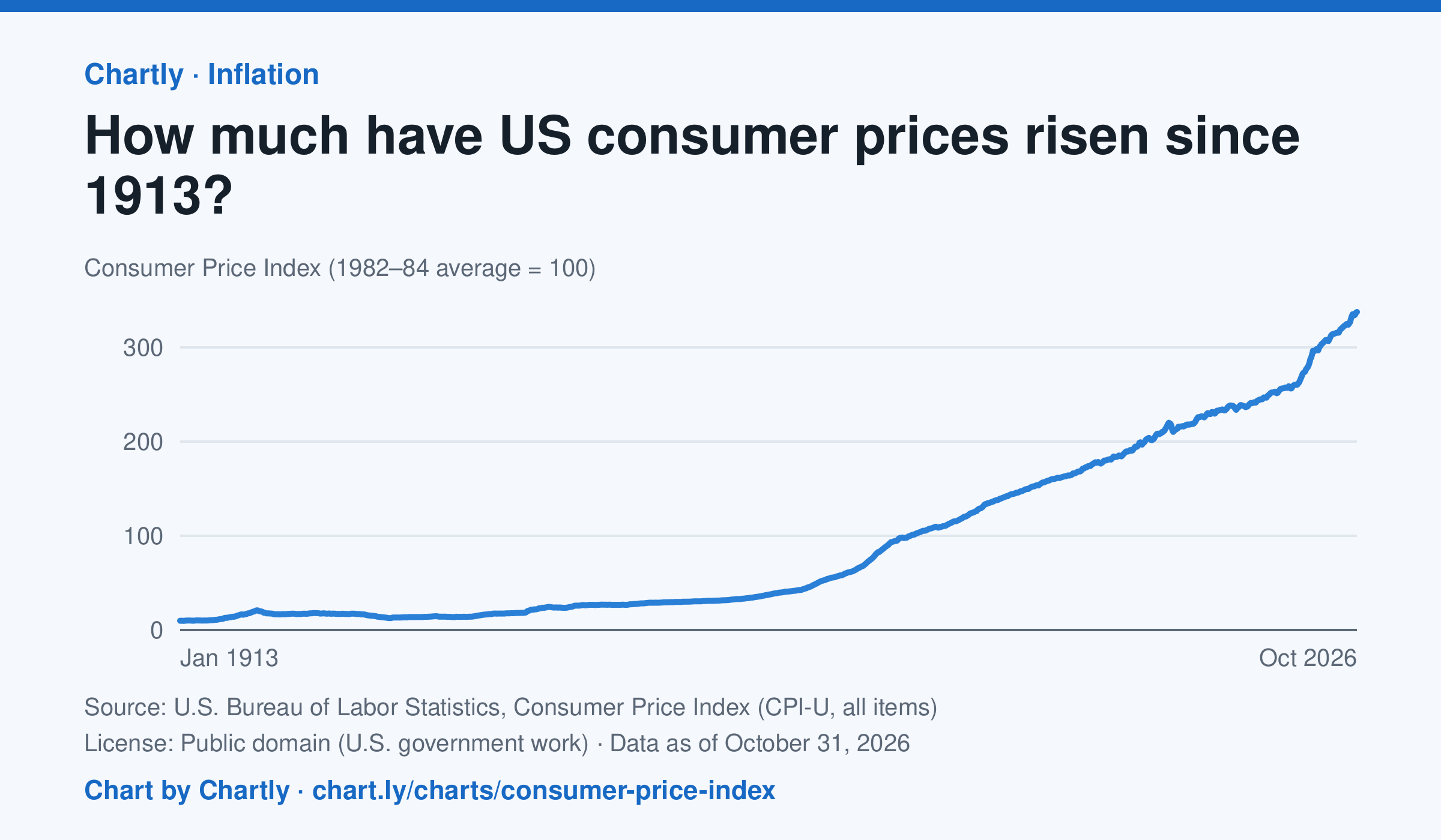
Consumer prices in October 2026 were 34 times their level in January 1913, when the Consumer Price Index begins: what cost $1 then cost about $34 in 2026. They were 2 times their level of January 2000. The index tracks what a typical basket of goods and services costs city households, with 100 as its 1982–84 average. Prices fell after 1920 and again in the early 1930s. October 2025 is missing because BLS collected no prices that month, during a lapse in federal funding.
Source: U.S. Bureau of Labor Statistics, Consumer Price Index (CPI-U, all items) (Public domain (U.S. government work)) · Data as of Oct 31, 2026
How to read this chart
The Consumer Price Index tracks the price of a fixed basket of things people buy, like food, rent, gas and clothing. It is an index, not dollars: prices in 1982 to 1984 are set to 100, so a value of 300 means the basket costs three times what it did then. Divide any two points to see how many times prices grew between them.
Questions
- How many times higher is the newest value than the first value on the chart? What does that mean for what $1 bought in 1913?
- Find a stretch where the line goes down. What does a falling index mean for prices, and when did it happen?
- Why does the government use a basket of many things instead of the price of just one item, like bread?
Chart and numbers: chart.ly/charts/consumer-price-index · More free charts at chart.ly
Chart 2 of 3 · Space
How many planets outside our solar system are discovered each year?
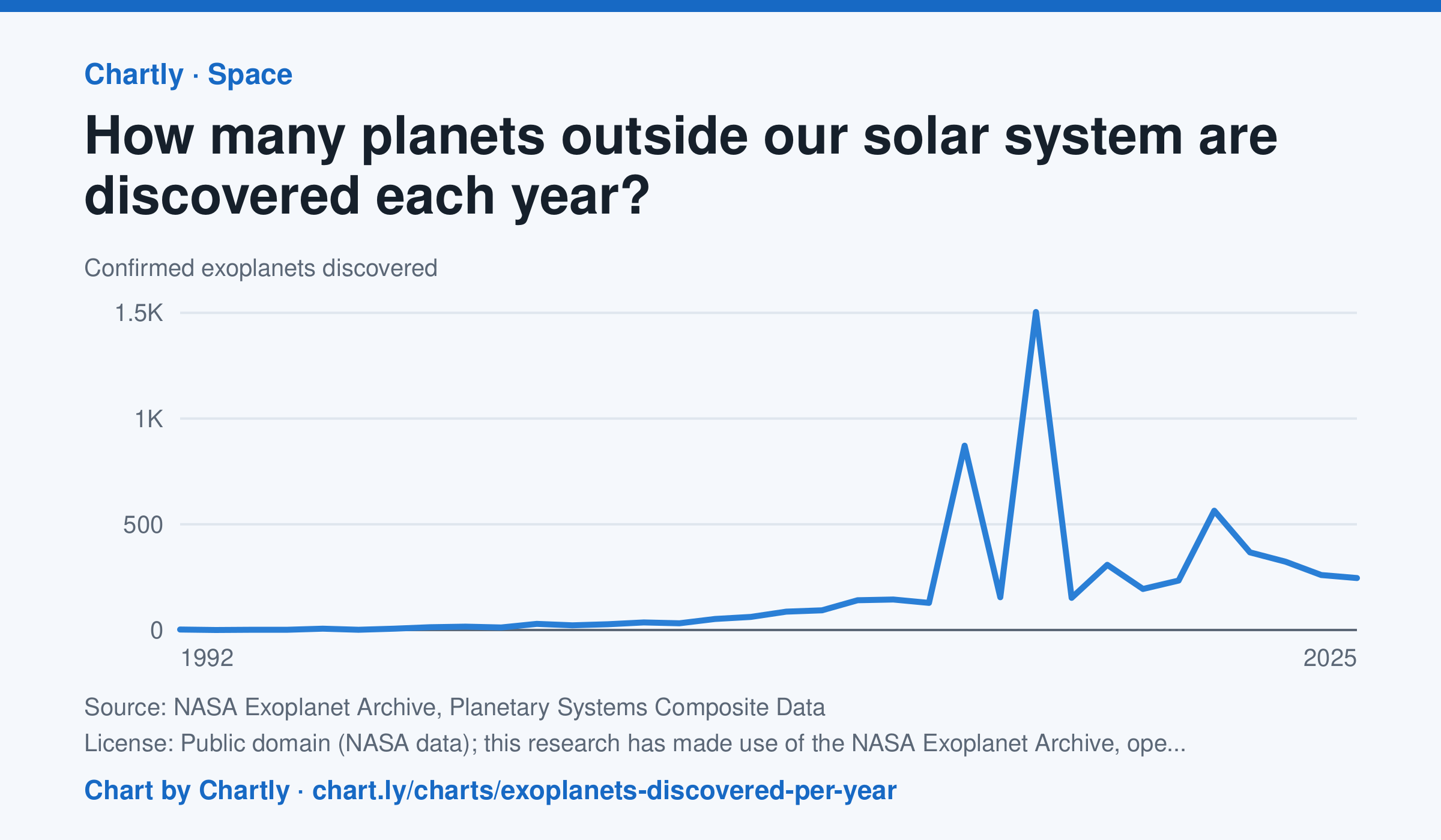
Astronomers confirmed 245 new planets around other stars in 2025. The first were found in 1992, and the count leaped in 2014 and 2016 (872 and 1,504), when NASA's Kepler team confirmed hundreds of its candidates at once. The archive counts a planet in the year its discovery was published and keeps adding late confirmations, so recent years can still rise.
Source: NASA Exoplanet Archive, Planetary Systems Composite Data (Public domain (NASA data); this research has made use of the NASA Exoplanet Archive, operated by Caltech under contract with NASA) · Data as of Dec 31, 2025
How to read this chart
Each point is how many planets around other stars, called exoplanets, astronomers confirmed in a year. The count depends on telescopes as much as on the sky: a new space telescope can confirm hundreds at once. The numbers come from NASA's Exoplanet Archive.
Questions
- Find the two biggest jumps on the chart. What could cause so many planets to be confirmed in one year?
- How many planets were confirmed in the first year on the chart, and how many in the newest year?
- Does a big year on this chart mean there were more planets in space that year? What does it really measure?
Chart and numbers: chart.ly/charts/exoplanets-discovered-per-year · More free charts at chart.ly
Chart 3 of 3 · Climate
How much has the US warmed since 1895?
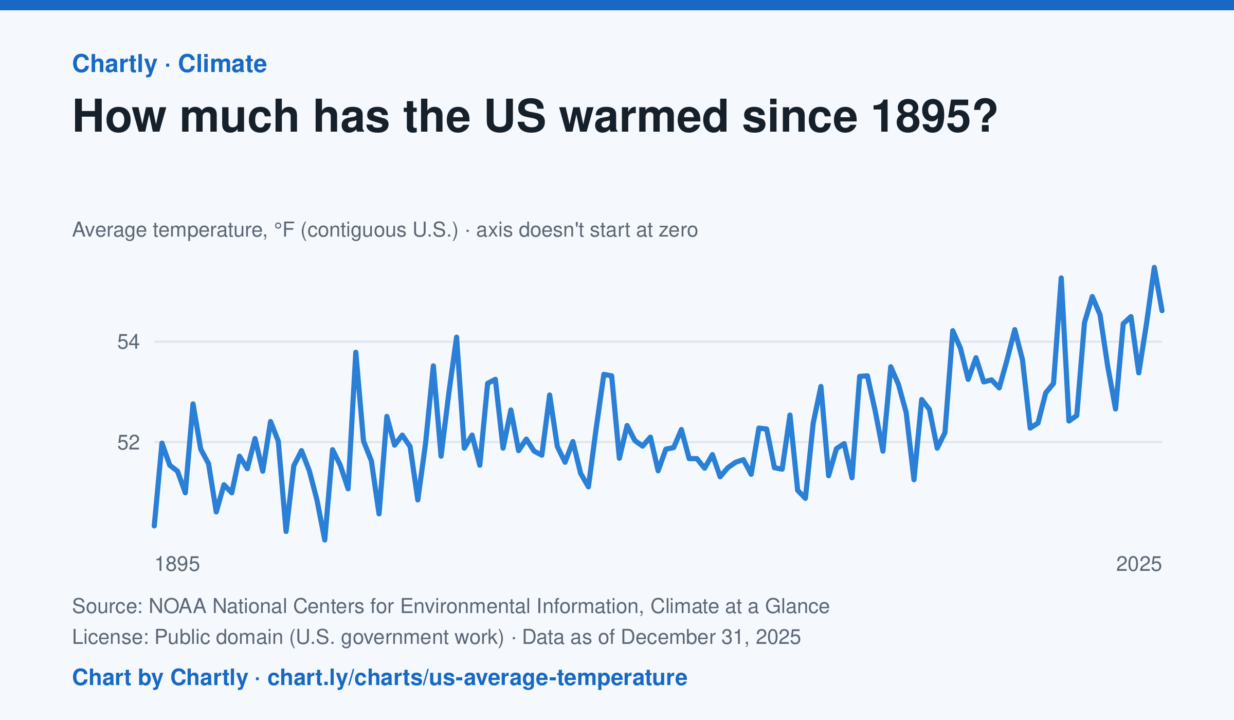
The contiguous US averaged 54.6°F in 2025. The warmest year since records began in 1895 was 2024, at 55.5°F. Through 2025, the dashed trend line, the straight line that best fits every year, rose about 0.18°F a decade, or 2.3°F since 1895, and warming had sped up to about 0.5°F a decade since 1970. Alaska and Hawaii aren't included.
Source: NOAA National Centers for Environmental Information, Climate at a Glance (Public domain (U.S. government work)) · Data as of Dec 31, 2025
How to read this chart
Each point is one year's average temperature across the lower 48 states, in degrees Fahrenheit. The axis doesn't start at zero, so a small rise looks steep: read the numbers on the axis, not the height of the line. The dashed line is the trend, the straight line that best fits every year; single years bounce above and below it.
Questions
- Find the warmest and coolest years on the chart. How many degrees apart are they?
- Why might one year be much cooler than the year before, even while the trend line keeps rising?
- The axis doesn't start at zero here, but bar charts always do. Why is that fair for temperatures but not for bars?
Chart and numbers: chart.ly/charts/us-average-temperature · More free charts at chart.ly