Print this worksheet, or choose "Save as PDF" in the print window to share a file.
Chart worksheet
Charts to read and discuss
Name:
Class:
Date:
Chart 1 of 2 · Jobs and wages
How much do US workers earn an hour?
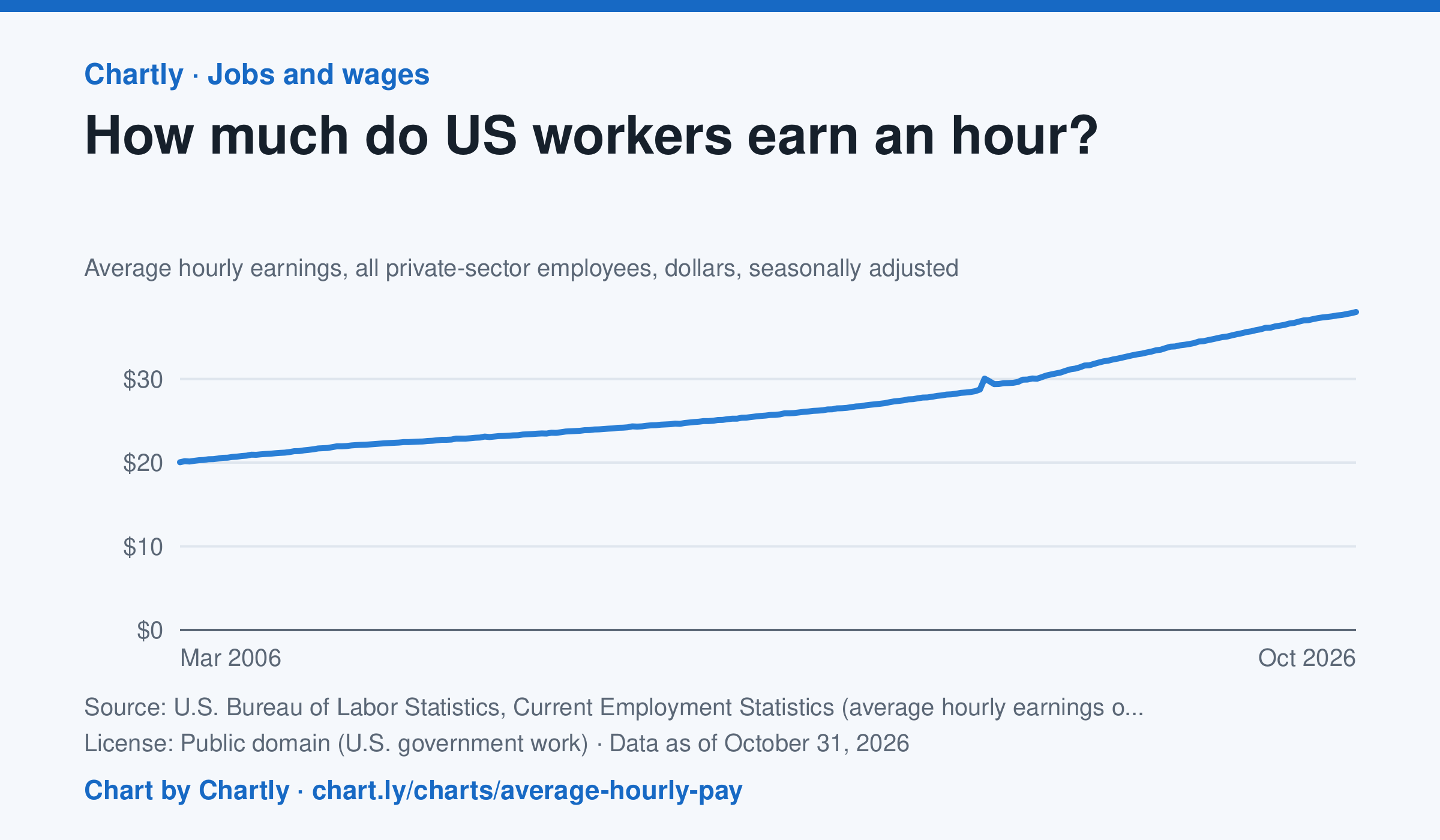
Private-sector employees earned an average of $38.00 an hour in October 2026, 3.1% more than in October 2025 and 1.9 times the $20.04 of March 2006, when the series begins. That is in dollars of the day, not adjusted for inflation; the monthly jobs report compares it with prices. The average rose sharply in spring 2020 because the pandemic put mostly lower-paid people out of work, not because pay jumped.
Source: U.S. Bureau of Labor Statistics, Current Employment Statistics (average hourly earnings of all employees, total private) (Public domain (U.S. government work)) · Data as of Oct 31, 2026
How to read this chart
Each point is the average hourly pay of private-sector employees in one month, in dollars, before taxes. It is not adjusted for inflation, so a rise in pay doesn't always mean workers can buy more. Hover or tap a point to read its month and value.
Questions
- How much did average hourly pay change from the first month on the chart to the newest?
- Find a month when pay jumped more than usual. Can you think of a reason that might happen, other than everyone getting a raise?
- If prices rose faster than pay over a year, were workers better or worse off? How could you check that with another chart?
Chart and numbers: chart.ly/charts/average-hourly-pay · More free charts at chart.ly
Chart 2 of 2 · Crime
Which big U.S. cities have the most violent crime?
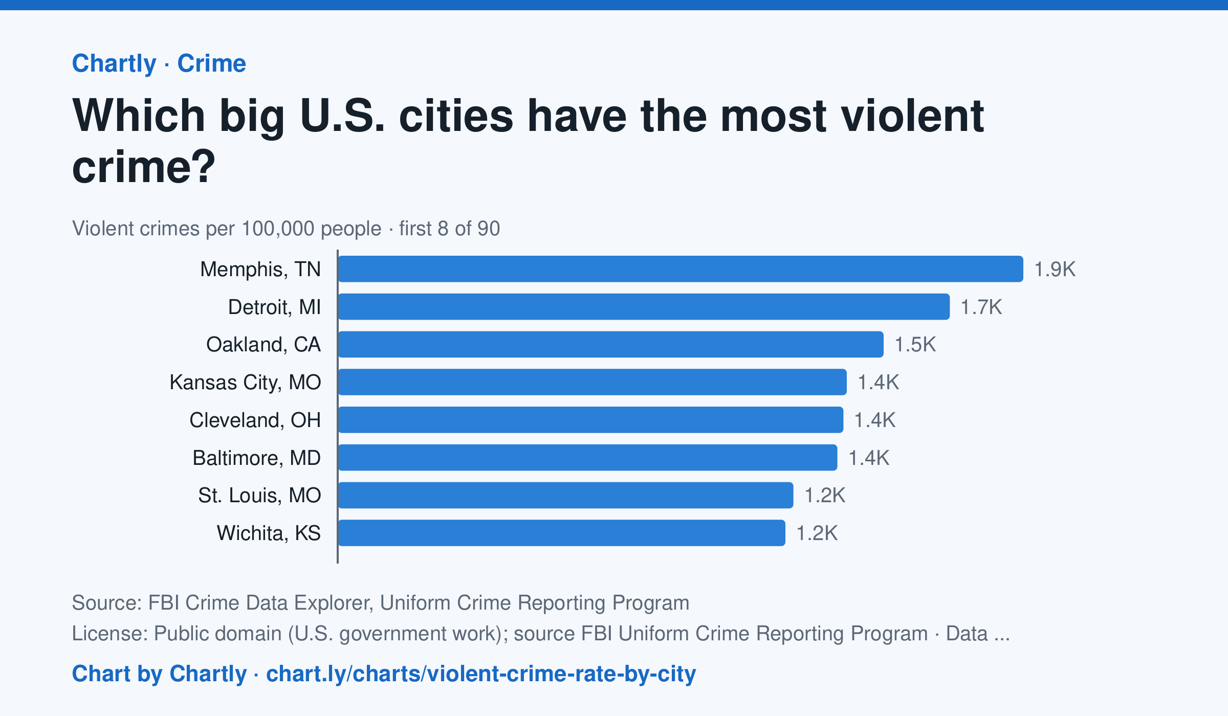
In 2025, Memphis, TN had the highest violent crime rate of the 89 biggest U.S. cities whose police reported a full year to the FBI, about 1,853 per 100,000 people, followed by Detroit, MI (1,654) and Oakland, CA (1,475). Irvine, CA (79) and Virginia Beach, VA (101) had the lowest; the U.S. rate was about 330. Violent crime is murder, rape, robbery and aggravated assault. In 2025 the police in New Orleans, Orlando and St. Petersburg, Florida, didn't report a full year of crimes, so they are left out. Each rate is per person the department serves, and a few, such as Las Vegas, Honolulu, Jacksonville and Louisville, serve their whole county. A city's rate also depends on where its borders fall, so compare cities with care.
Source: FBI Crime Data Explorer, Uniform Crime Reporting Program (Public domain (U.S. government work); source FBI Uniform Crime Reporting Program) · Data as of Dec 31, 2025
How to read this chart
Each bar is one big city's violent crimes reported to the FBI in a year (murder, rape, robbery and aggravated assault) for every 100,000 people its police department serves. The dashed line is the rate for the whole U.S. Dividing by population makes big and small cities fair to compare, but a city's rate also depends on where its borders fall.
Questions
- Find the city with the highest rate and the one with the lowest. About how many times higher is the top rate?
- Some departments police a whole county, suburbs included. How could that change a city's rate compared with one that covers only its downtown?
- These are crimes reported to police. What kinds of crime might never show up in these numbers, and why?
Chart and numbers: chart.ly/charts/violent-crime-rate-by-city · More free charts at chart.ly